ICE REIMAGINED
Client
Self-initiated
Sector
Food & Beverage
Food Service
Scope
Concept Design
Identity Creation
Branding
Packaging
Service Design
The aim was to broaden the product line of packaged ice and differentiate it by making ice more fun and more desirable. I created a set of colorful flavored ice products that will beautifully accompany any party drinks. Besides the flavored ice, the second differentiation was to deliver it upon order through a mobile application. I developed a new brand around it with the name Qube, simply put "Flavored ice delivery.”
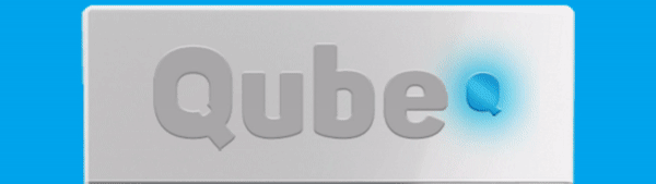
Logo -still
This is the still version of the logo, which is designed to work as both still and animation. The symbol at the end, which is extracted from inside the initial Q letter and moved to the end, is made to represent delivered ice. This form became the basic form on which the visual identity is based. The colors and the forms of the logo are simple, pure, icy, dynamic, fun, and most importantly Qubby.
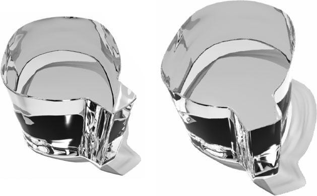
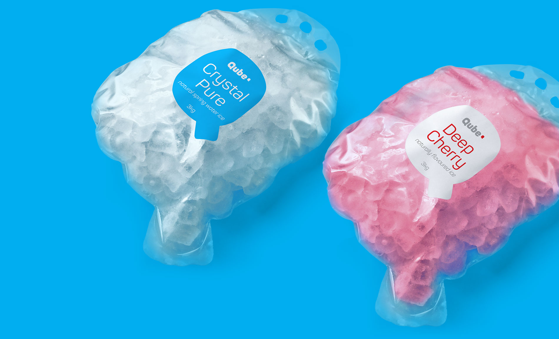
Qube Ice Shape
The shape of the ice has adapted the typographic shape of the Qube in order to differentiate the product. Since this is the product the end-user will put into their drinks, its shape that echoes the logo will dramatically reinforce the branding and increase its recognisability.
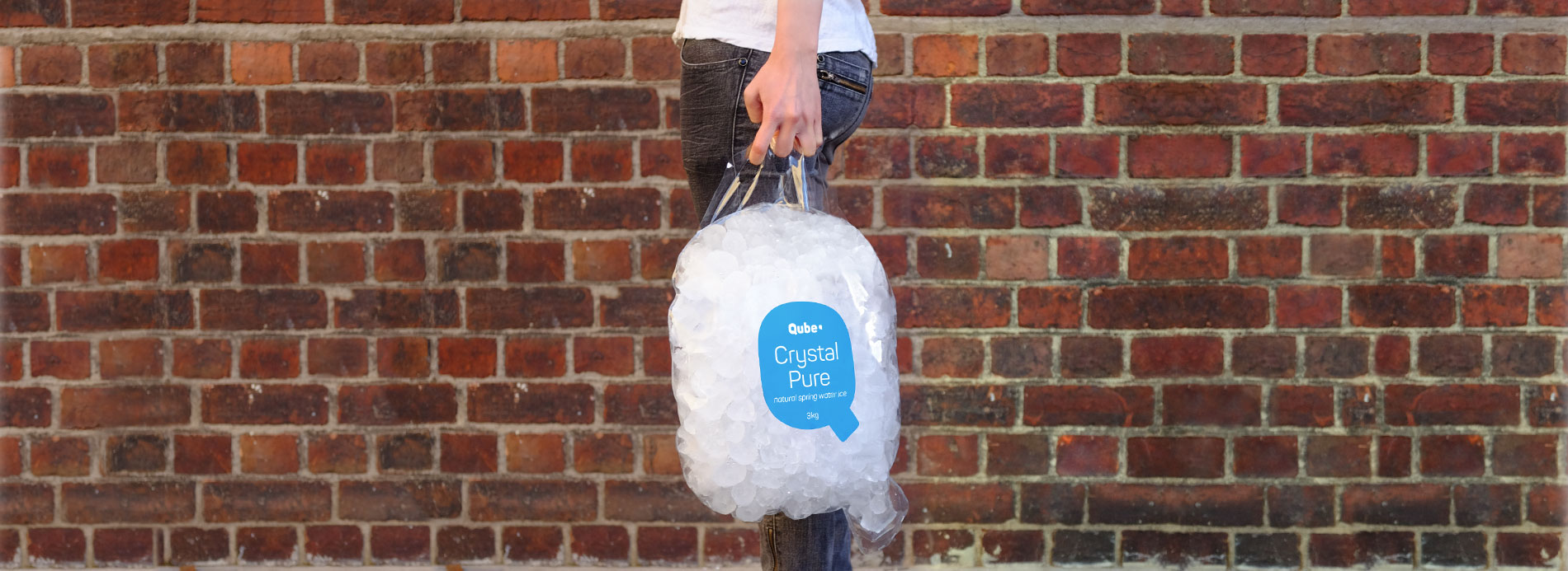
PACKAGING
When you have a brand that is based on a simple form, it becomes possible to adapt it for a wide range of uses. Here, the package also wears the typographic form of the logo. While the designed package helps communicate and showcase the product, its unique form reinforces the brand. It has some great usability and marketing advantages as well:
- its handle makes it easy to carry;
- it encourages the user to carry it alone without putting it inside another bag thus; acting as a perfect advertising agent while the user carries it;
- the bottom tip of the Q makes it easy to open the package and pour the ice;
- and most importantly, all these are achieved by using minimal and inexpensive materials and printing, reducing the economic as well as the environmental cost.
Fun and Desirable
Flavored ice cubes are colored, packed, and named in a playful way to stand out and evoke curiosity and desire. Each flavor is associated with a unique color, together creating a harmonious set.
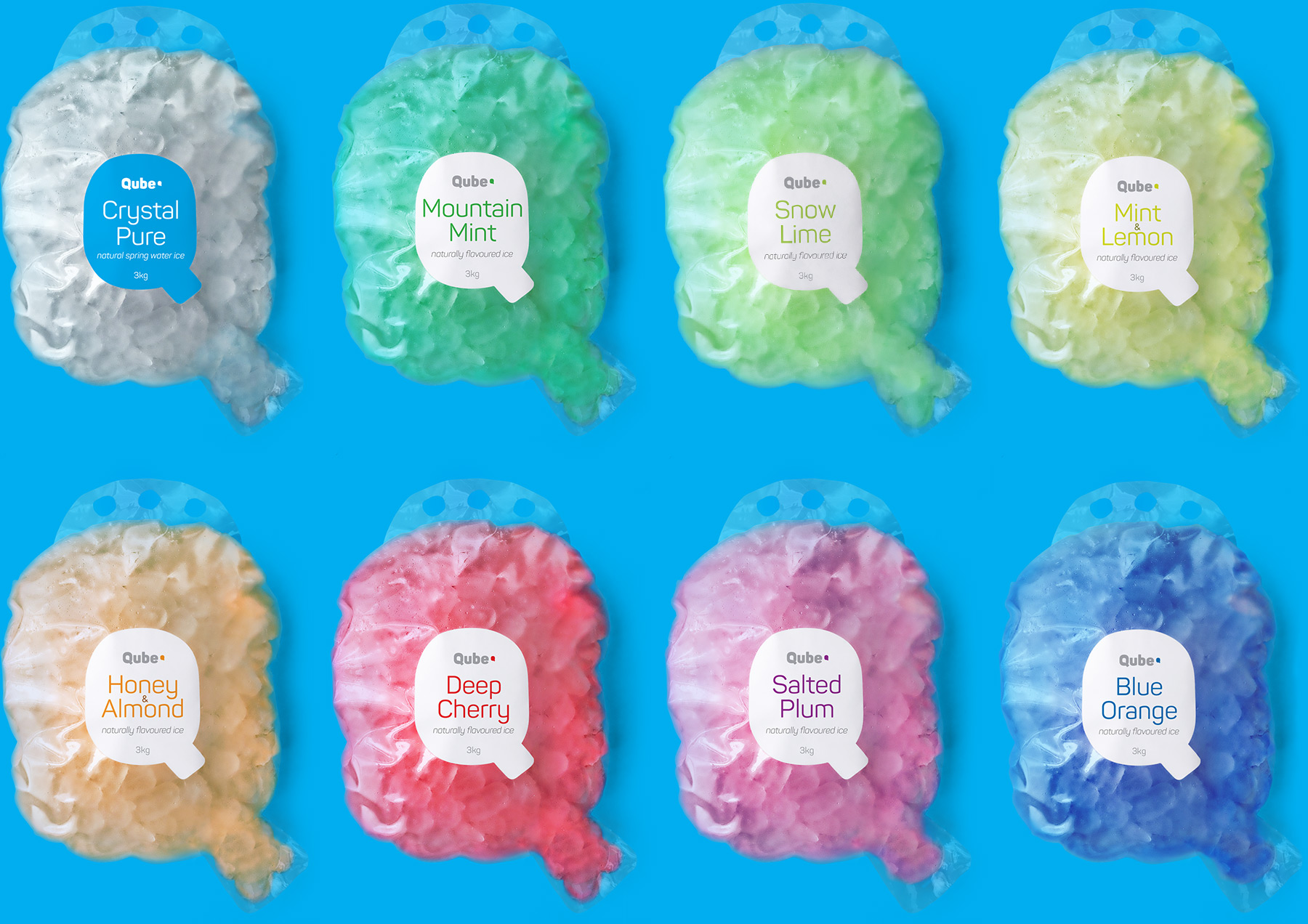

Flavoures & Colors
The playful and tasteful nature of the product manifests itself in the branding through a beautiful and refreshing color palette. Each color representing a flavor will liven up any parties and venues as well as the supermarkets it is sold at.
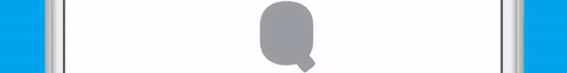
Digital vs Print
Today, the brands' appearances in the digital environment are more important than the physical environment if not equally important. The website or the mobile application in which the user can order the product for delivery, will sometimes be the first place the users will meet the brand and it will be the place the users interact with the brand more often. So I designed the brand considering the importance of its digital existence, creating the logo as a simple yet effective animation that communicates the rich flavors and the possibility of delivery.
Animating Logo
The animating logo has two phases: the introductory phase and the continuous phase. The introductory phase represents delivery, in which, the smaller Qube* shape gets extracted from the large one and moves to the end forming the initial letter ‘Q’ and the word ‘Qube’. The continuous phase with changing colors represents various flavors.
While the logo is animated for digital platforms, it doesn't have to be boring in the physical environment. So I designed the logo to be also animated for some uses in the physical world. This will build a strong correlation between the physical and digital look of the identity, ensuring a consistent experience of the brand.
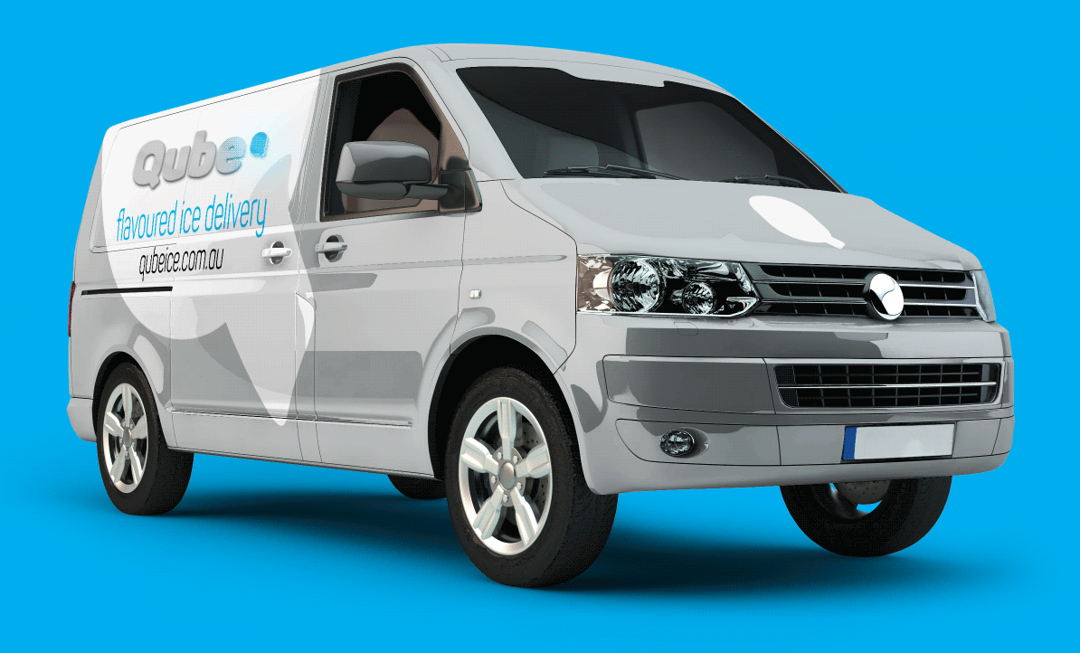
Delivery Van Livery
Since the delivery is one of the differentiating points of the product, the design of the delivery van livery is very important as well especially because It is one of the touch points at the time of delivery. Besides, it can also function as a great advertisement on the way to the delivery.
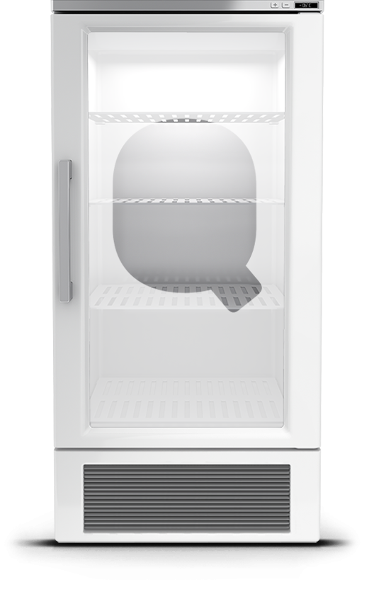
Storage Chest
The same idea is also adopted in the design of the ice storage chest that will be placed in the supermarkets. The animating light of the logo on the storage chest will grab the attention of the shoppers in the supermarket.