MORFOZ YAPI BRANDING
Client
FourByNorth Studio
Sector
Architecture
Construction
Scope
Identity Creation
Branding
Print Design
Branding for the Turkish extension of Austrian company Elk, which is the biggest prefabricated building producer in Europe. It was a project from FourByNorth Studio. I have designed the visual identity as well as a brochure for the product. Its slogan "Degisen dünya, degisen yapilar." means "Changing world, changing buildings."

Logo
The company has a highly flexible production system and the buildings produced by the company could be customized for any need. The identity design is based on the notion of "morphosis". I designed the identity to distance it from boxy prefabricated houses and to represent a high-end product and service to be offered in Turkey. The logo is based on simple architectural forms. Diagonal lines are used to achieve maximum dynamism to reflect change and adaptation.

Color Palette
The products were environmentally friendly, made of 90% natural materials such as wood. Besides, the company introduced a new technology to Turkey targeting upmarket. Therefore, this color palette is designed to stand for nature, luxury and innovation.

Pattern
The pattern emphasizes the idea of flexibility and morphosis echoing the logo. It is derived from the most basic architectural unit "square" so that it can create a feeling of morphosis in the context of architecture.
MORFOZ YAPI BROCHURE
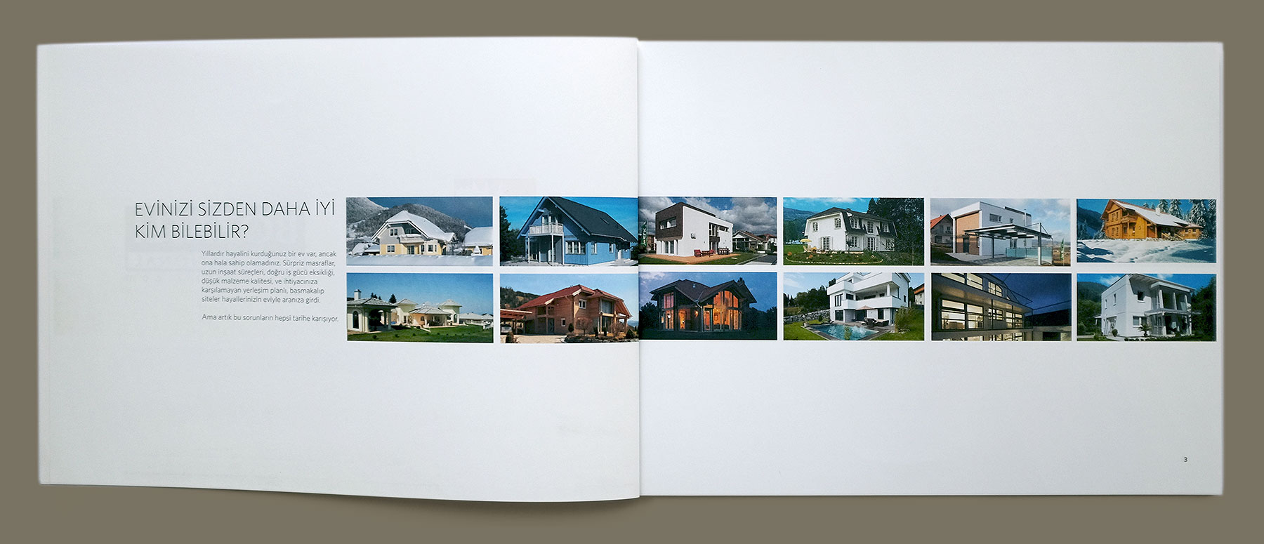
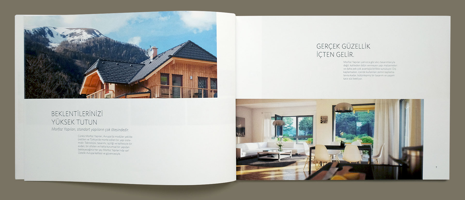
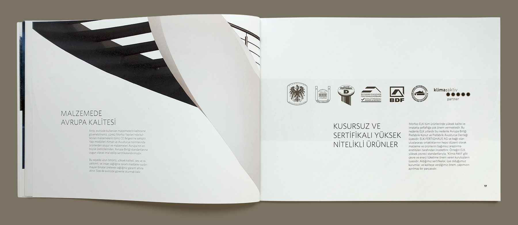
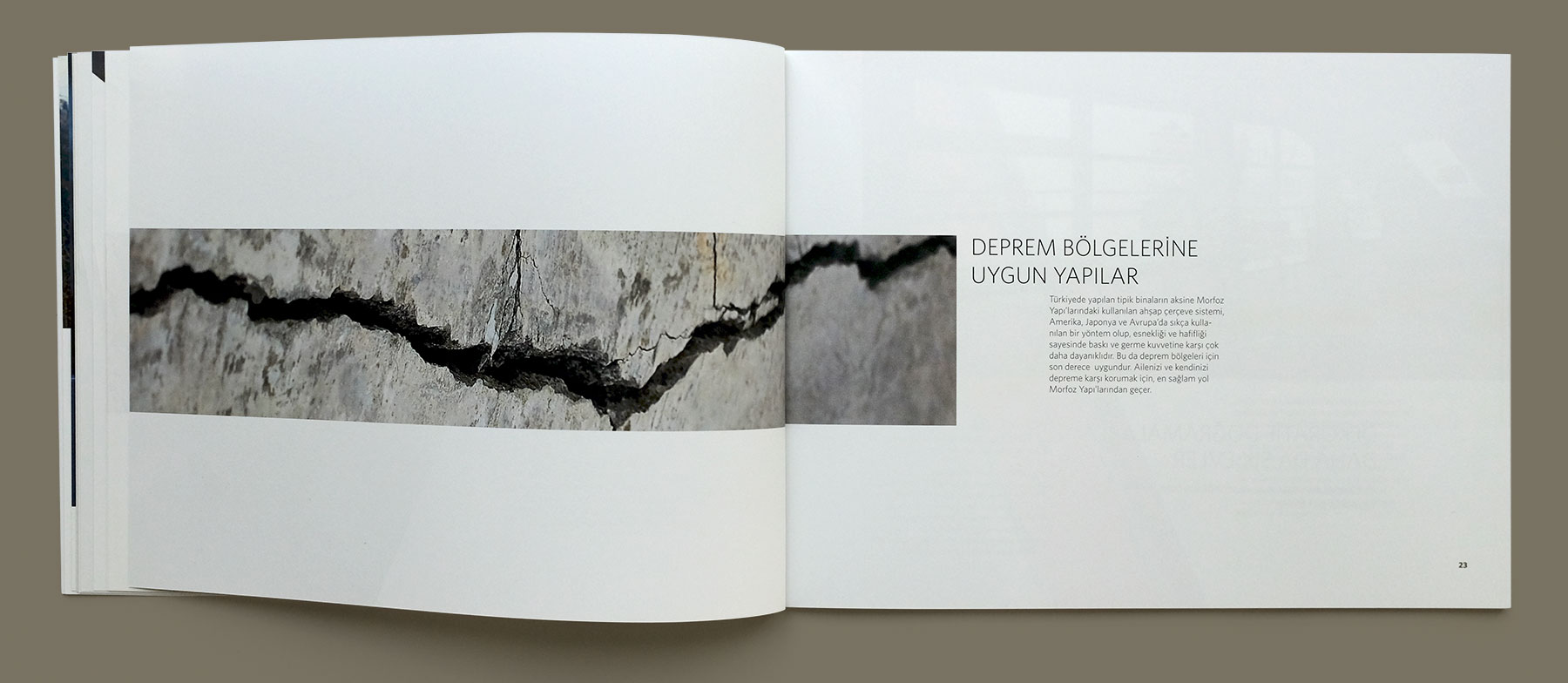
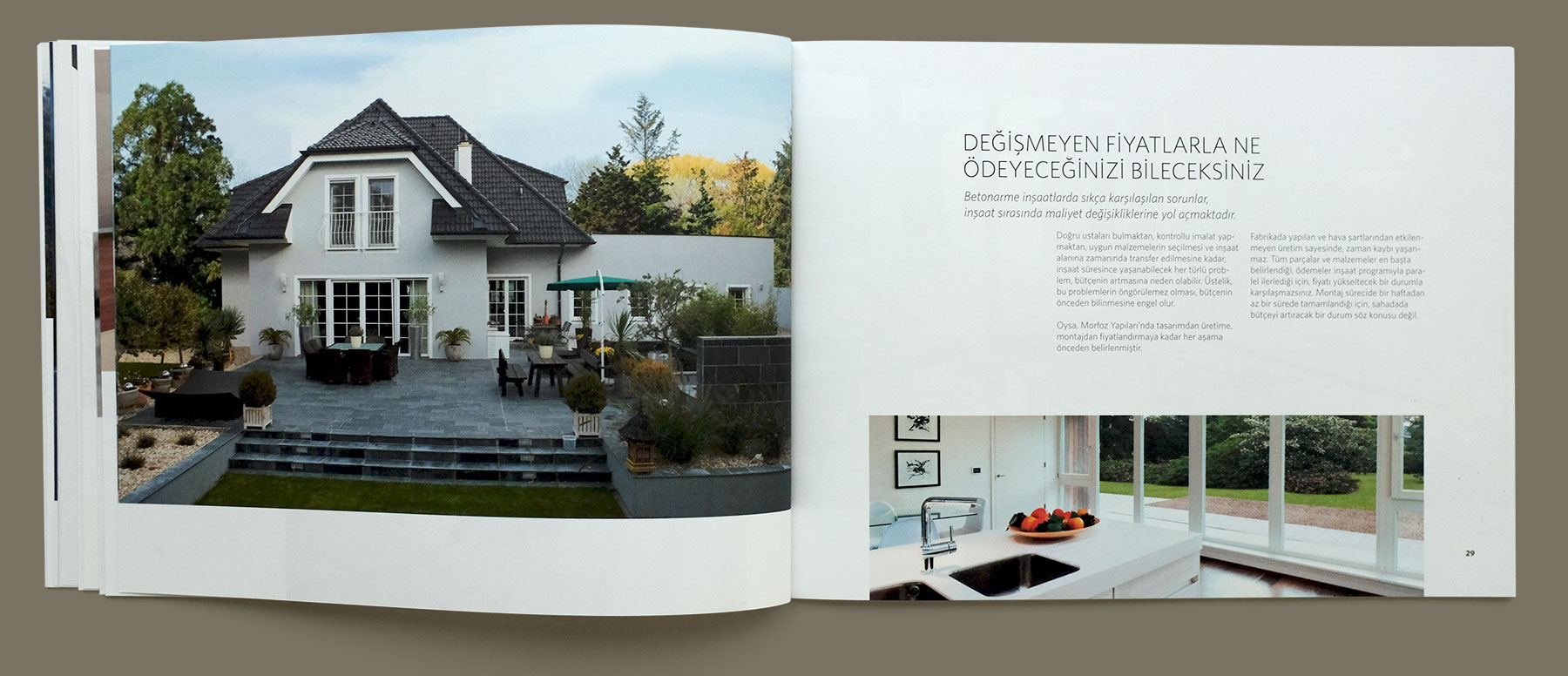
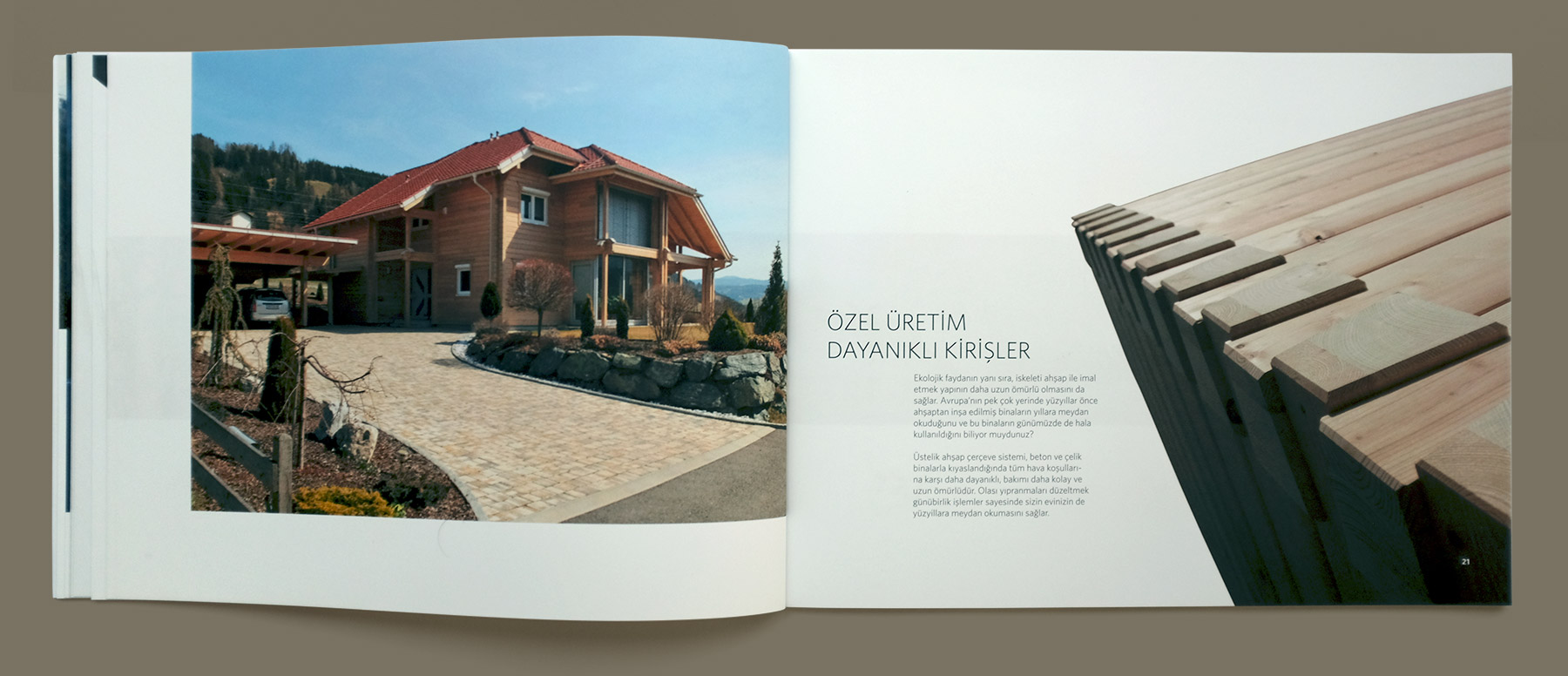
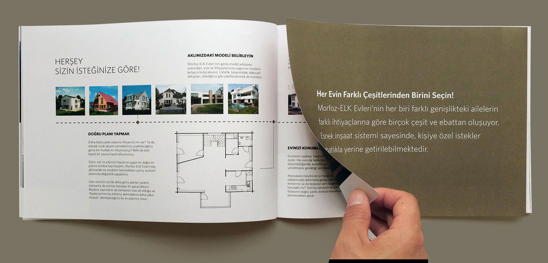
The purpose of the brochure was to introduce the product and the brand in the Turkish market. The visual layout is systematically evolving on its grid from the beginning to the end in order to evoke excitement in parallel with the development of the story. However, it always keeps a certain degree of consistency respecting to the main structure. This evolvement of the layout supports the idea of morphosis which is what the brand is about.
Some Close-up Details
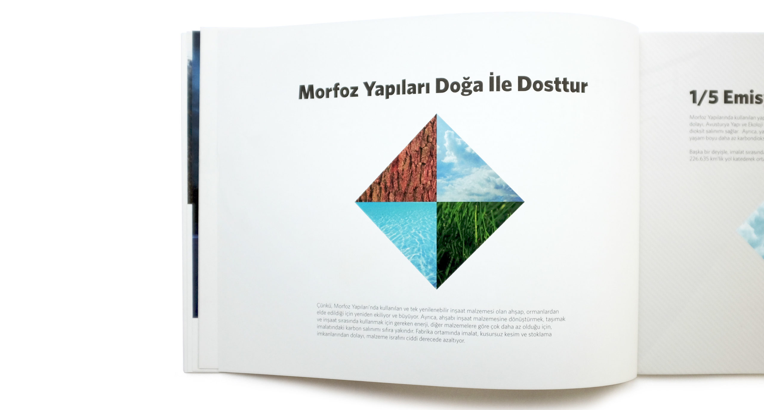
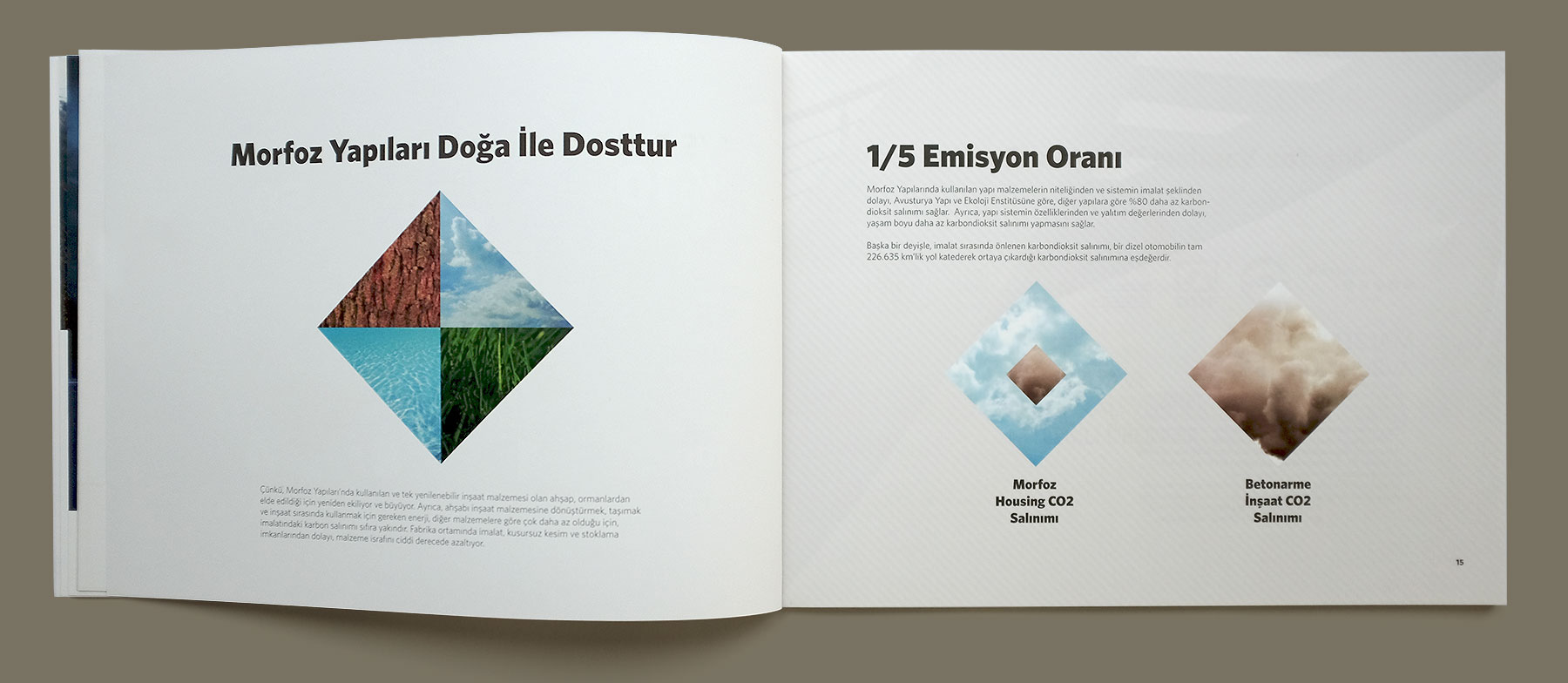
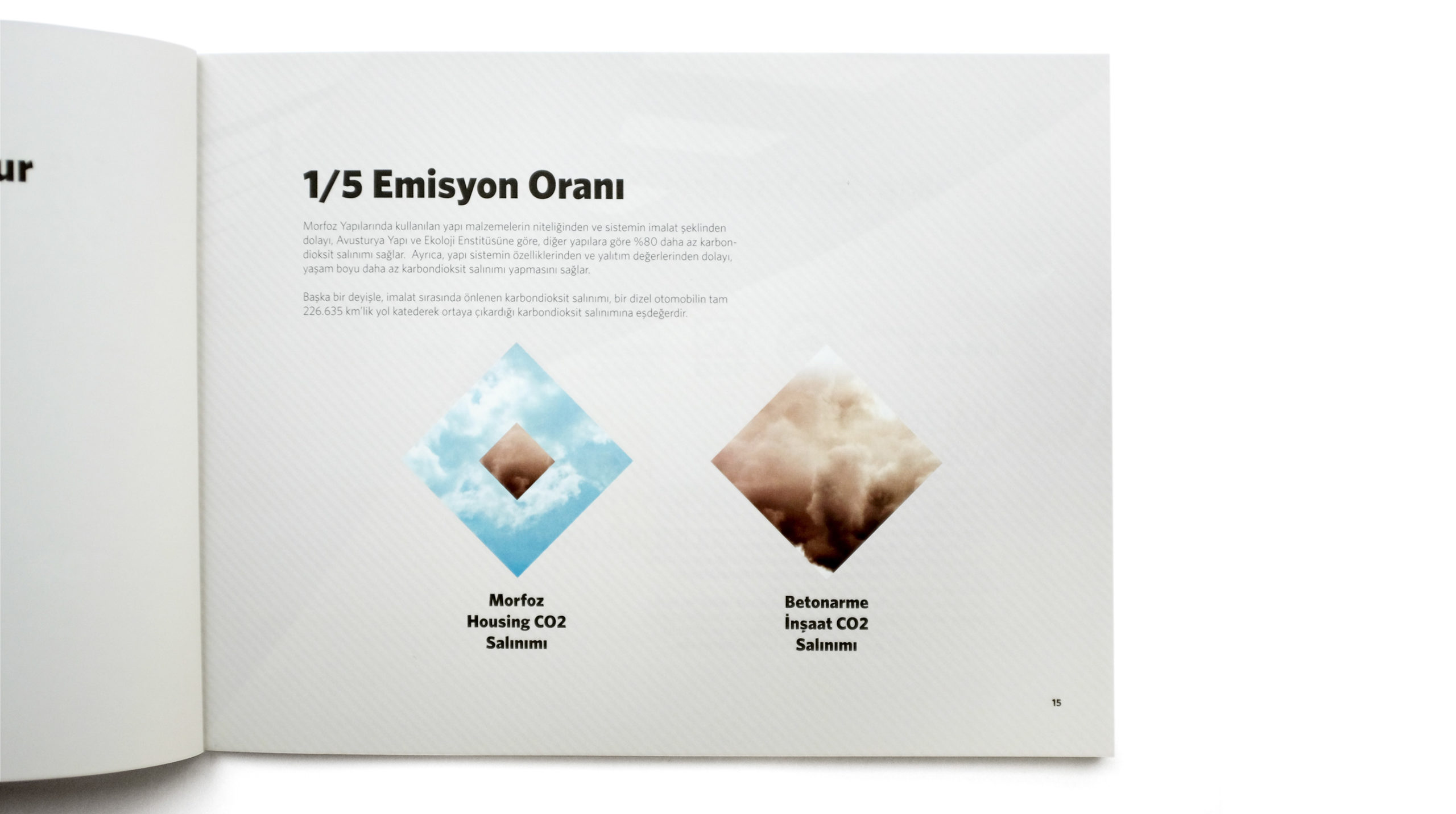
Infographics Showing the Comparasion of CO2 Emission to the Traditional Type of Housing
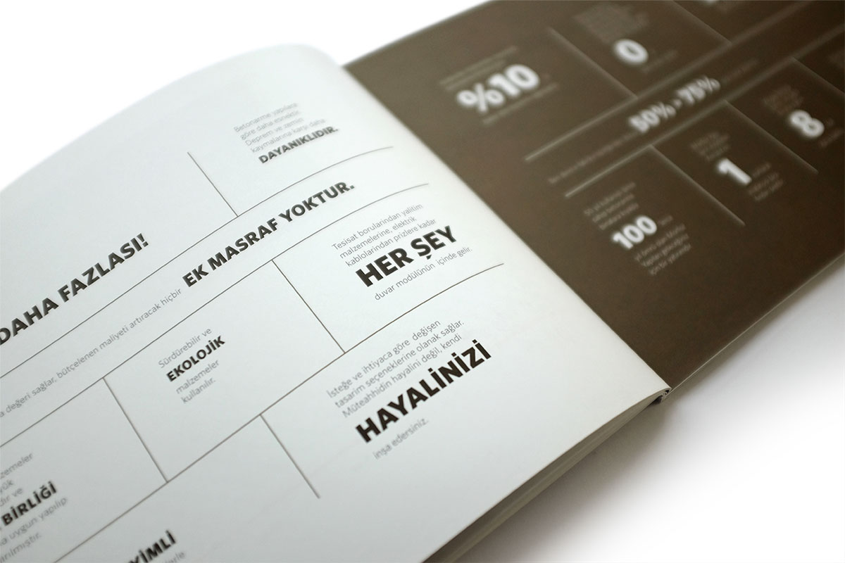
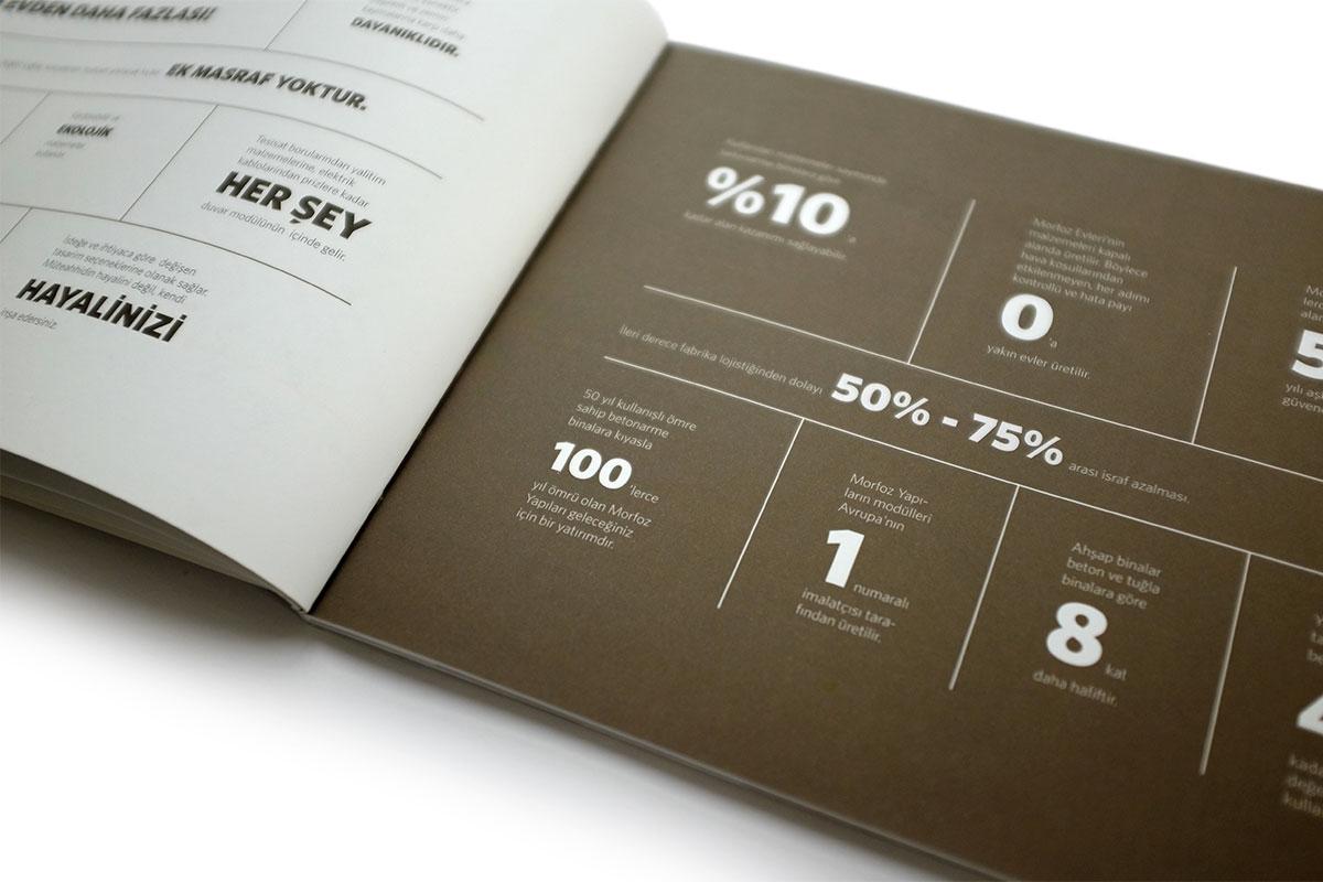
Additional Infos and Facts Page
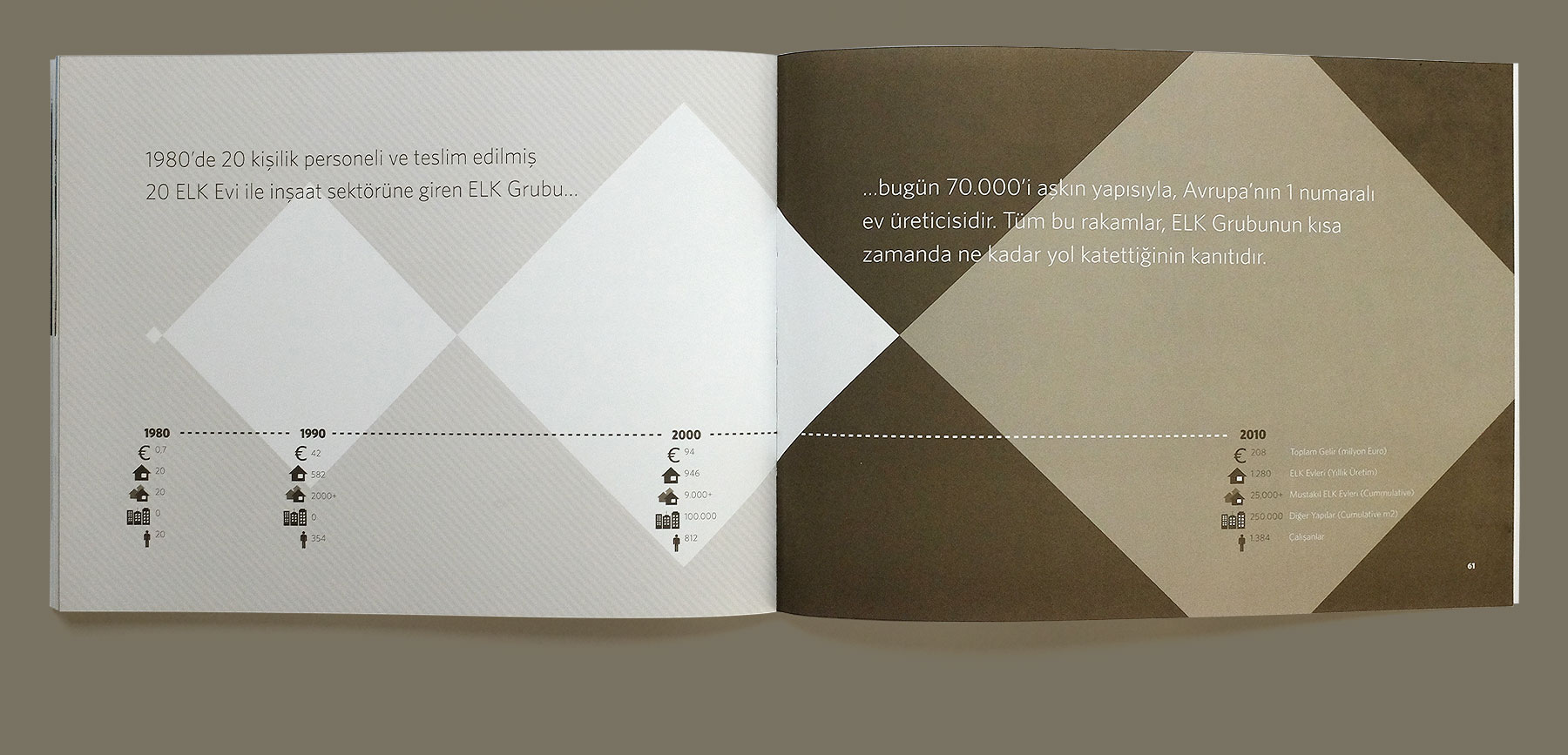
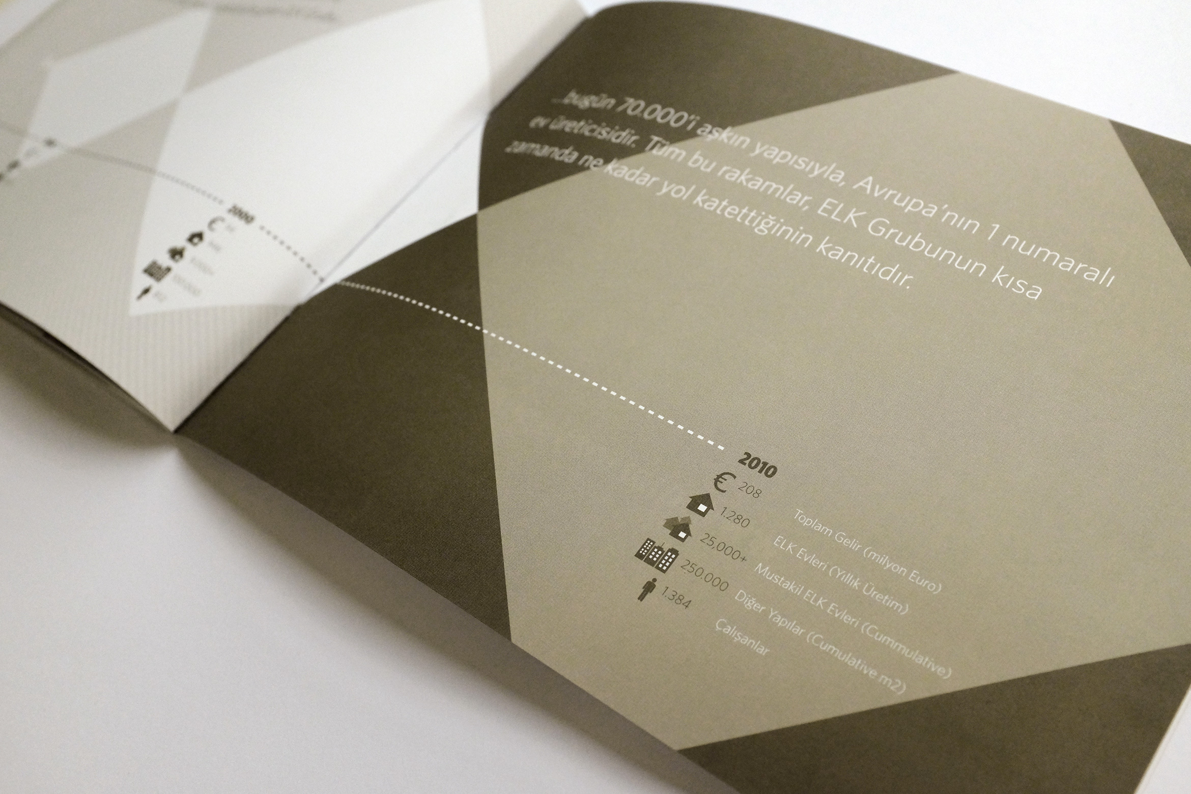
Infographics Showing the Company Growth
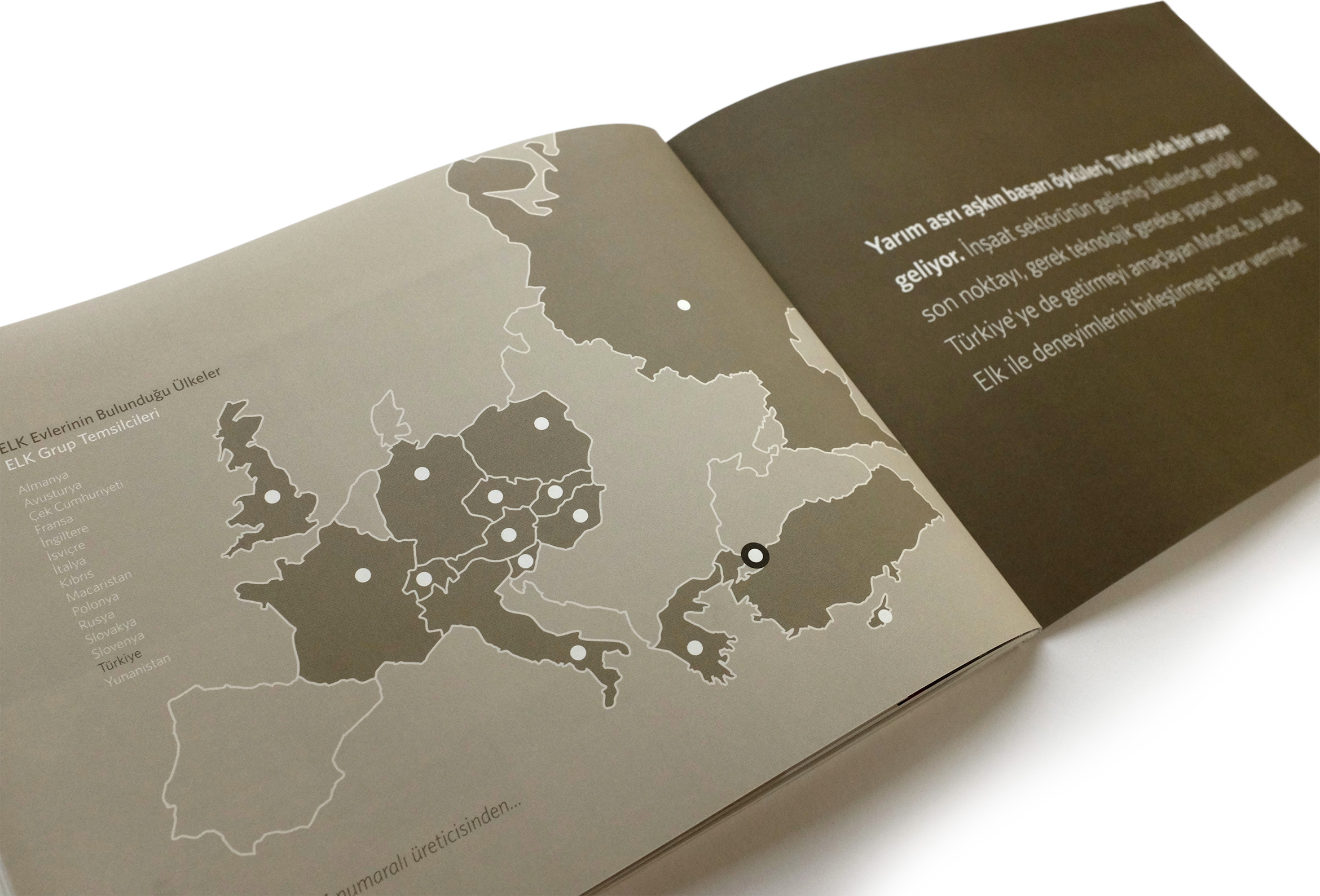
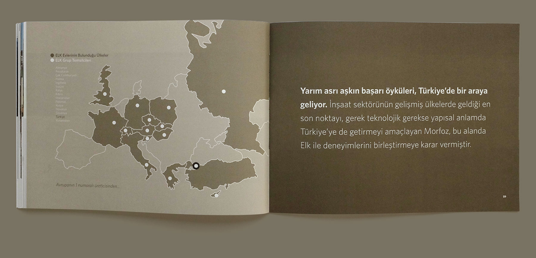
Map Showing the Locations of all the Sales Distributors & Representatives
