
A DYNAMIC WIDGET FOR
REAL-TIME USER NEEDS
A Gateway to What Matters: Designing Poste Italiane’s Dynamic Widget for Real-Time User Needs
Client
Poste Italiane
unicreditgroup.eu
Scoop
Product Design
UX/UI
Innovation
Digital Service
Sector
Postal Services
Banking
Financial Services
Introduction
This case study presents an innovative approach to digital transformation undertaken by Poste Italiane, as they transitioned to a unified digital platform. The project centers on designing a cutting-edge map widget for their all-encompassing 'One App', which integrates various services such as banking and postal operations. This endeavor not only required a blend of UI/UX design principles but also demanded innovative thinking to merge diverse functionalities into a singular, seamless user experience. The widget was strategically placed on the homepage of the One App, symbolizing the harmonization of Poste Italiane's varied services into a unified interface.
My Role
In this groundbreaking project, my role transcended traditional product design. As the lead innovator and designer, I was responsible for orchestrating the conceptualization, design, and implementation of the map widget. My challenge was to craft an innovative solution that was not only aesthetically aligned with Poste Italiane's brand and user-friendly but also represented a leap in digital service integration. This entailed deep dives into user research, UI/UX design, prototyping, and collaborating closely with developers. A key aspect of my role was to ensure the widget was a beacon of innovation in the digital landscape of Poste Italiane.
Disclaimer: Before diving deep, I must mention that to adhere to my confidentiality obligations, certain details in this case study have been omitted. All opinions and interpretations are personal and do not necessarily represent Poste Italiane’s views.
CONTEXT
Unifying Services for a Seamless Digital Experience
Poste Italiane embarked on a visionary project to unify its diverse array of services into a single, comprehensive app, aptly named the One App. This initiative was aimed at consolidating various standalone apps - covering banking, postal services, insurance, telecommunications, and digital identity management - into a single, streamlined platform. Accenture had already laid the groundwork for the app's Design System and major components. However, to further enhance this ambitious project, additional expertise was sought. I joined the project through Tangity Design agency to contribute specifically to this transformative endeavor. My contribution focused on designing a prominent home widget, a critical piece in bringing this digital transformation to fruition and enhancing user interaction with Poste Italiane’s consolidated services.
THE CHALLANGE
Integrated Service Access: Overcoming Fragmentation in Service Delivery
The central challenge of this project was to develop a map widget for the One App that transcends traditional design boundaries. It needed to be more than a simple tool; it had to resonate with a diverse user base, each with their unique needs and behaviors. The widget’s design required adaptability, ensuring it could present relevant information efficiently without overwhelming the interface.
The focus was on making the widget a dynamic gateway, providing users with precisely what they need, quickly and intuitively. The goal included:
1.
Addressing the Service Integration Complexity
The integration of diverse services like Postepay for prepaid cards and PosteMobile, BancoPosta for banking, and PosteID for digital identity highlights the complexity and the innovative approach needed to overcome the fragmentation in service delivery.
2.
User Empowerment
The aim is to enable users to swiftly complete tasks, such as making payments or picking up packages, with minimal effort. This involves surfacing relevant actions and information prominently, facilitating self-service.
3.
Simplifying Poste Italiane Services
Offering a straightforward access to the relevant services, the goal was to make interactions with Poste Italiane's services simple and efficient, enhancing the overall user experience on the app’s home screen.
BUSINESS PERSPECTIVE
Aligning with Poste Italiane's Unified Service Vision
The widget's development was a key part of Poste Italiane's broader strategy to create a unified app, combining various services into one seamless platform.
1.
Unified App Strategy
This widget reflects Poste Italiane's commitment to streamline and integrate diverse services like banking, postal, and insurance into a single application, addressing the challenge of fragmented service delivery and enhancing overall user convenience.
2.
Cross-Functional Integration
The widget plays a pivotal role in this strategy, serving as a central access point and unifying functionalities from different services within the app.
3.
Enhancing User Experience
By addressing past challenges of service fragmentation, the widget contributes to a more cohesive and user-friendly digital experience, in line with Poste Italiane's vision for digital innovation.
4.
Contributing to Business Revenue
By offering location-based functionalities, the widget simplified essential tasks, promoting more frequent use of the company's services such as PostaPay, thereby increasing revenue.
5.
Driving Customer Loyalty
The widget was expected to bolster customer loyalty and operational efficiency, representing a significant advancement in how users engage with Poste Italiane’s array of services.
6.
Strategic Digital Transformation
This project is a significant step in Poste Italiane’s broader digital transformation strategy, aiming to modernize and streamline its service offerings.
This strategy underscores the widget's significance in Poste Italiane's mission to improve customer engagement and operational efficiency, marking a significant step in digital transformation and customer service enhancement.
DESIGN PROCESS
From Strategy to Interface: Poste Italiane’s Widget From Ground Up
Embarking on the design process for Poste Italiane's map widget, the first phase, Research, involved a thorough analysis of user behavior, best practices, and competitive landscape to inform our design choices. Ideation and Conceptualization followed, where creative brainstorming led to tangible solution frameworks. User Flow mapping ensured a seamless navigational experience based on user scenarios, which then materialized into tangible forms during the Wireframing and Prototyping stage. User Interface Design translated these blueprints into fine-tuned and functional designs. Collaborative Refinement was the next pivotal phase, harnessing team insights for iterative improvements. The process culminated in Validation and Iteration, testing and tweaking the widget for an optimal user experience.
Research
>
Ideation and Conceptualization
>
User Flow
>
Wireframing and Prototyping
>
User Interface Design
>
Collaborative Refinement
>
Validation and Iteration
RESEARCH
Uncovering Insights:
The Research Journey
The research phase was a critical component of this project, laying the groundwork for the innovative design of the map widget. This section involved several key activities:
Trend Analysis and Benchmarking
The process combined trend analysis with industry benchmarking to gain a comprehensive understanding of the digital mapping and location-based service sector. Trend analysis focused on current developments in digital map interfaces, highlighting features that could enhance user engagement and satisfaction. In parallel, industry benchmarking involved a detailed examination of key players like UPS My Choice, DHL eTrack, Revolut, Google Maps, Waze, HERE WeGo, and Sygic GPS Navigation. This approach included analyzing their features, usability, design, functionality, and integration capabilities, as well as reviewing customer feedback. Together, these methods provided valuable insights into best practices, innovative features, user expectations, and areas for improvement, guiding the development strategy for the map widget.
Insights Gained from Trend Analysis and Benchmarking
Combining insights from the User Experience Assessment and broader trend analysis, the following key findings emerged:
1.
Context-Awareness and Dynamic Content Adaptation
Emphasizing the widget's ability to adapt its content and CTA based on the user's current situation and preferences, as seen in Google Maps and Waze, is critical.
2.
Real-Time Information
UPS My Choice and DHL eTrack excel in providing real-time tracking and updates, a trend that is increasingly expected by users for accuracy and efficiency in location-based services.
3.
Seamless Integration with Core App Functions
Apps like Revolut and HERE WeGo demonstrate the importance of integrating mapping features with other app functionalities, like banking or route customization, enhancing the overall utility of the app.
4.
Balancing Detail with Usability
Offering sufficient detail without overwhelming users, a balance achieved by apps like Sygic GPS Navigation, is vital.
5.
Accessibility and Inclusivity
Ensuring the design caters to a diverse range of users, including those with disabilities, through features like voice navigation and high-contrast modes.
6.
Simplified and Intuitive Interface
A trend towards more streamlined and intuitive map interfaces, with clear, concise and easy-to-interpret visual cues, was observed. This simplification helps in reducing cognitive load and improving user experience, especially for new or less tech-savvy users.
User Personas and Scenarios
Development of user personas and scenarios to represent the diverse user base of Poste Italiane. This aided in envisioning how different types of users would interact with the widget in various contexts.

Urban Pickup
Matilde - 25 Years Old: Working full-time, Matilde orders her new credit card for locker pickup at Poste Italiane. Upon notification of its arrival, the app widget intelligently suggests navigating to the locker. As Matilde approaches the locker, the app, recognizing her proximity and her pending package, offers an option to access the locker directly.

Postal Quest
Giovanni - 45 Years Old: Visiting his aunt in Rome, Giovanni orders a gift for his aunt to pick it up at a Poste Italiane office. Notified by SMS of its arrival, he uses the app, which automatically displays the Poste Italiane office where the package has arrived and navigation option.

Checkout Escapade
Davide - 35 Years Old: In a store to buy shoes, Davide sees a PostePay label at the cashier. Opening the app, it detects his location in a PostePay-enabled store and suggests a cardless payment option right away.

Cashless Conquest
Giorgio - 35 Years Old: A designer who prefers not to carry cards, Giorgio uses the app for cash withdrawals at Poste Italiane ATMs. When near an ATM, the app widget shows its location on the map and offers an option to withdraw cash.
Technical Feasibility and Integration
In collaboration with Mario Greco, the Digital Mobile Lead (Poste Italiane), we conducted a technology assessment and integration planning for the widget.
Technology Assessment
Evaluating the current technological infrastructure of the One App to determine the feasibility of integrating the new widget. This included assessing the app’s capabilities in handling dynamic content and location-based services.
Integration Planning
Planning how the widget would integrate with other functionalities of the One App, such as navigation, payment systems, and user account information, ensuring a seamless user experience.
The Technical Challenge: Balancing Interactivity with Performance
The Problem: Interactivity vs. Performance Trade-off
A significant challenge emerged when integrating a fully interactive map directly on the widget that stands on the One App’s homepage. The extensive data required for real-time interactivity risked slowing down the app, posing a dilemma in maintaining both functionality and performance.
Creative Solution: Static-Dynamic Hybrid Widget
In response, a novel approach was developed. While the map within the widget is not fully interactive, displaying static images chosen from multiple scenarios like the user's last interaction with the map, the widget itself is highly dynamic. The call-to-action (CTA), text content, and selected map images are context-aware, adapting intelligently to the user's current situation. This design ensures that the widget remains interactive and adaptable, dynamically responding to user behavior and environment while preserving app efficiency.
This innovative solution, crafted in collaboration with Mario Greco, Digital Mobile Lead at Poste Italiane, effectively marries the need for dynamic user interaction with the technical limitations of real-time data processing.
The research phase was instrumental in shaping the widget's design and functionality, ensuring it was not only innovative and user-friendly but also aligned with the diverse needs of Poste Italiane's customer base.
SOLUTION
Crafting the Solution:
From Concept to Reality
The research phase was a critical component of this project, laying the groundwork for the innovative design of the map widget. This section involved several key activities:
Wireframing and Prototyping
The research and ideation phase transitioned into the creation of wireframes, which served as the blueprint for the widget's functionality. These wireframes outlined the basic structure and interaction flow, ensuring that the key features were logically organized and accessible. As the project progressed, these wireframes were refined into more detailed prototypes. The prototypes demonstrated the widget's dynamic content changes based on user context and included simulations of how the widget would display different CTAs like 'Navigate to the Postal Office', 'Pay Now', or 'Retrieve Package', helping us to test different ideas.
Final Design & Key Features
The final design of the map widget for Poste Italiane’s app represents a harmonious blend of functionality and aesthetics, tailored to meet the dynamic needs of the users. The widget's ability to adjust its display and call-to-action based on the user's situation marks a significant advancement in contextual responsiveness. Key features include:
A Glimpse into Innovation: A Small Part of the Mobile Wireframes of the HSEQ4you App Redesign.
Dynamic Content
Automatically updates to show relevant information like the nearest postal office, Posta Pay-enabled stores, or package collection points.
Context-Aware CTA
Intelligently changes the call-to-action button, such as 'Navigate to Postal Office', 'Pay Now', or 'Retrieve Package', based on the user's current needs.
Integrated Functionality
Seamlessly connects with other app features, enabling actions directly from the map widget, enhancing user experience and efficiency.
Throughout the design journey, a plethora of concepts were considered. The ultimate design emerged as a result of comprehensive research, creative ideation, and user-centered design principles, ensuring that the widget was highly functional, provided innovative solutions to user needs, visually maintained a well balance on the home screen and aligned with the brand's identity.
Seamless Integration: The Smart Widget Redefining Home
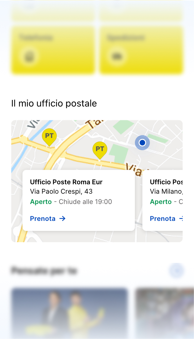
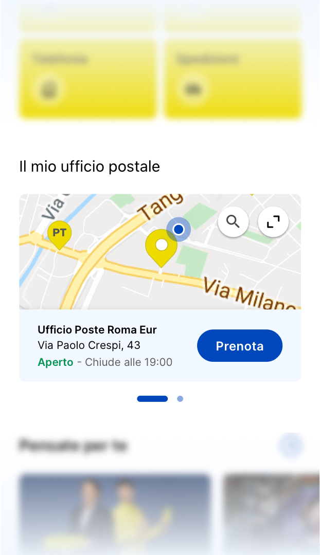
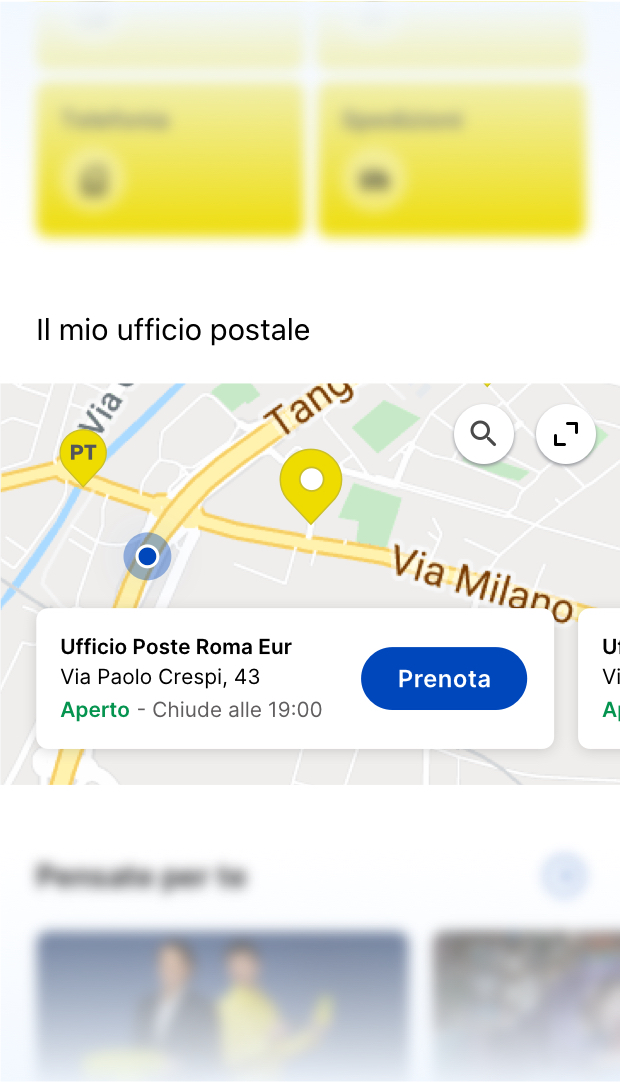
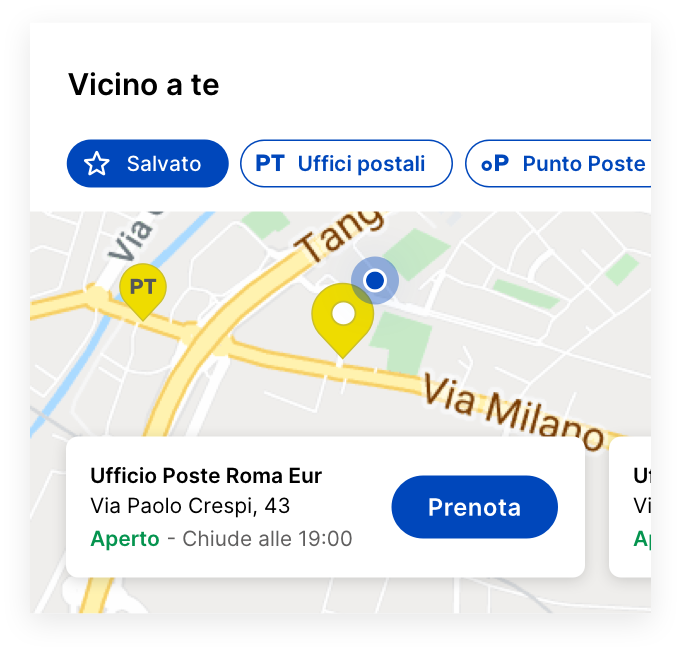
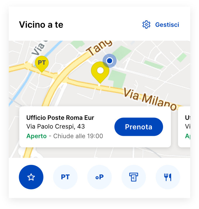
This widget, representing the "Vicino a te" (Near You) map functionality, evolves into a context-aware hub. It integrates seamlessly with Poste Italiane's main services, offering real-time, relevant user actions.
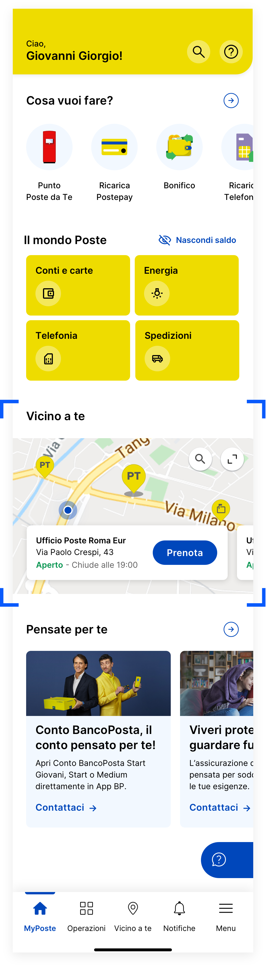
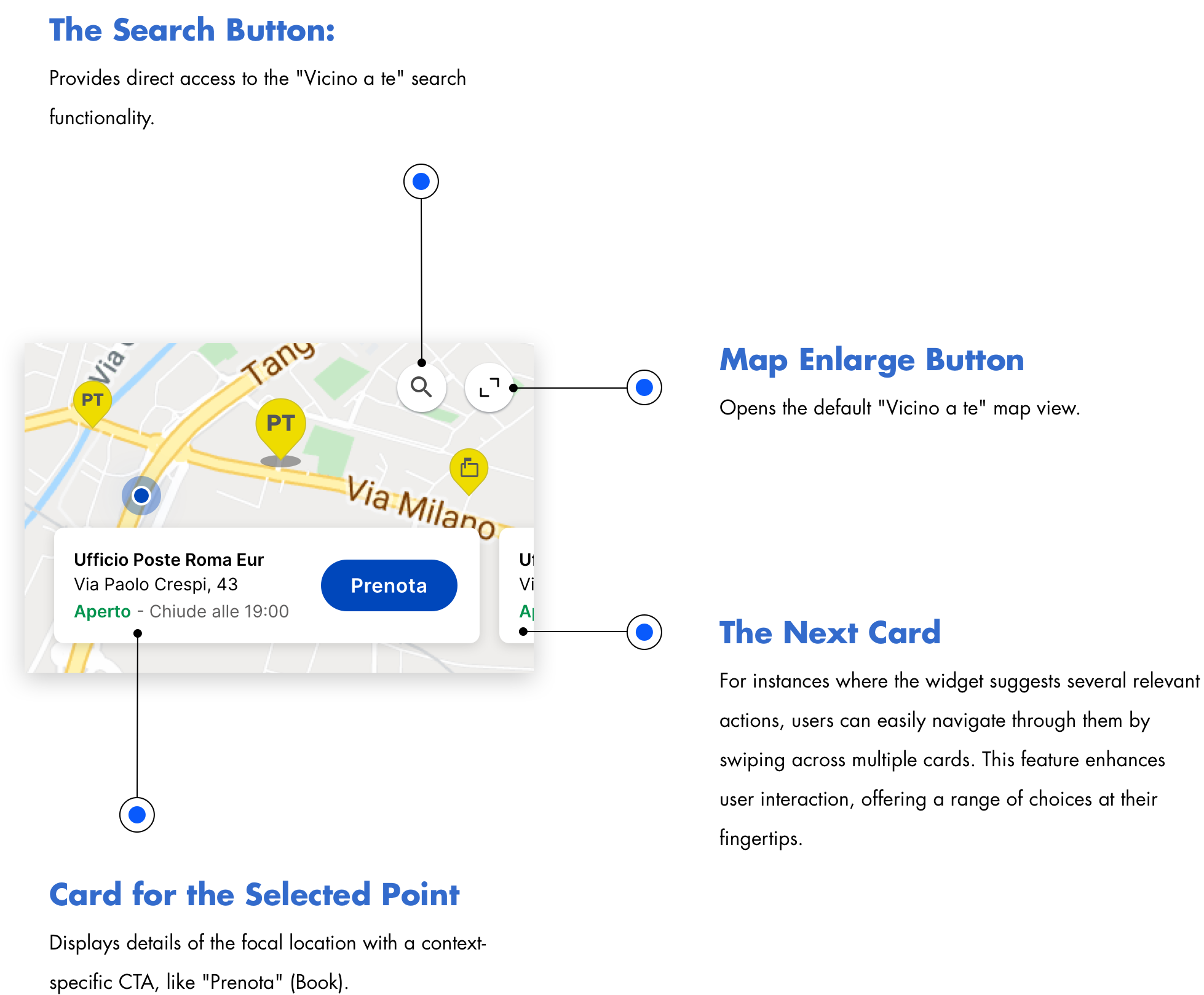
Possibilities Based on Context
This section showcases the widget’s ability to adapt and present tailored options based on the user's current situation and location. This dynamic feature of the widget not only enhances the overall user experience but also demonstrates the depth of contextual understanding built into the design. By offering relevant actions and information that change according to the user's immediate needs.
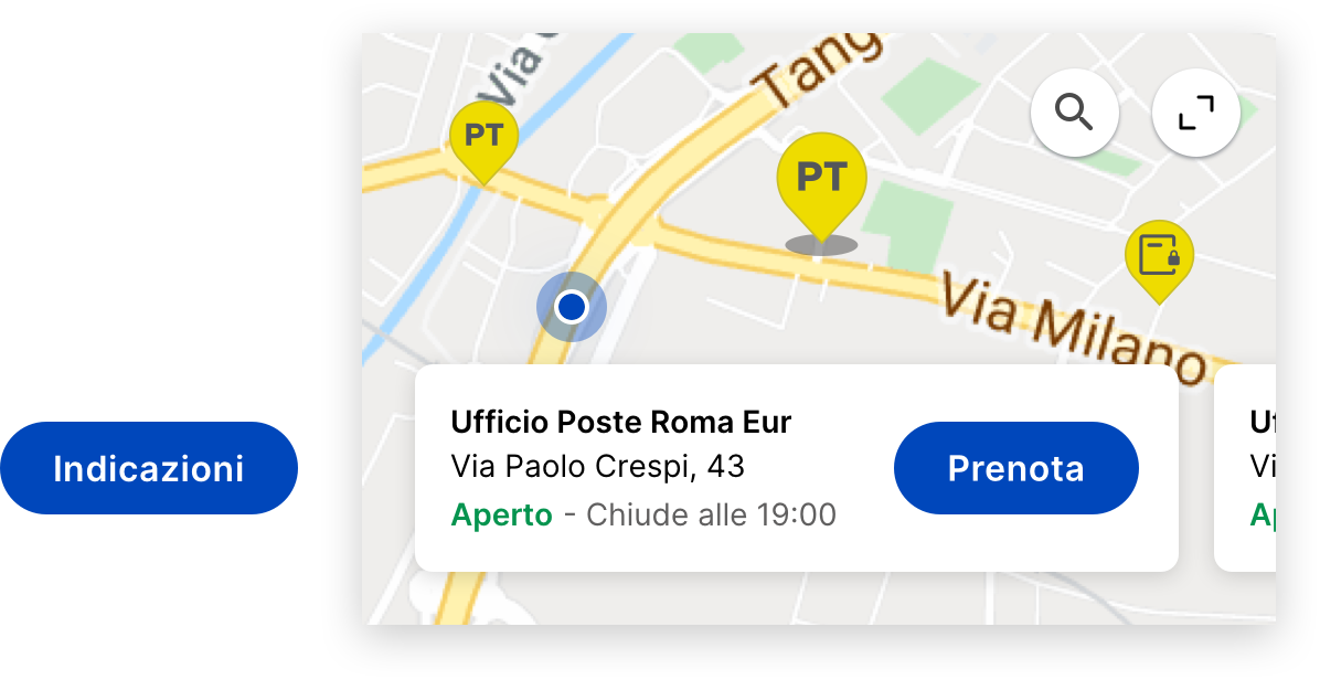
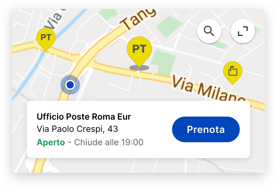
Postal Office
The widget dynamically adjusts its Call-to-Action (CTA) for the postal office based on the user's context. If there's an upcoming appointment, the CTA is set to "Indicazioni" (Directions) to guide the user to their location. Otherwise, it offers "Prenota" (Book) for scheduling new visits.
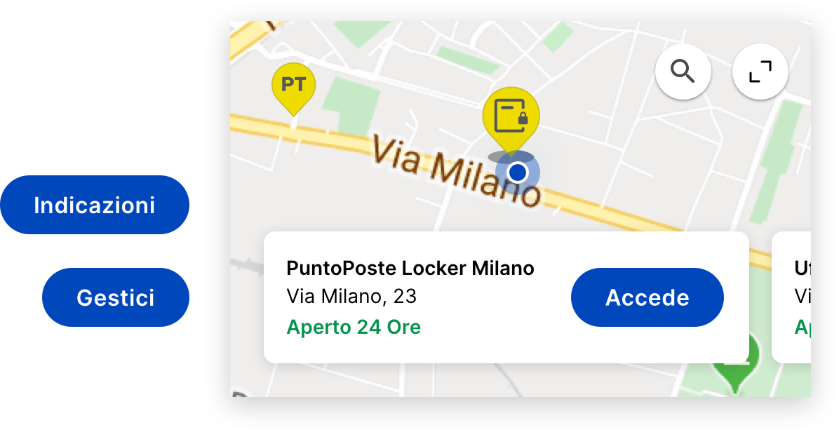
PuntoPoste Locker
The CTA varies from "Accede" (Access) to "Indicazioni" (Directions), or "Gestici" (Manage), depending on the user's proximity and package status.
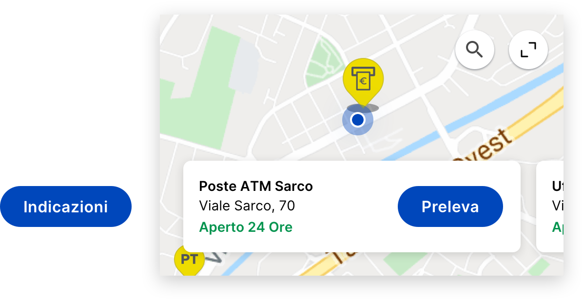
ATM
When near an ATM, the widget presents the "Preleva" (Withdraw) CTA, facilitating easy, cardless cash withdrawals using the app. This feature activates precisely when the user is at an ATM location, offering a seamless transaction experience.
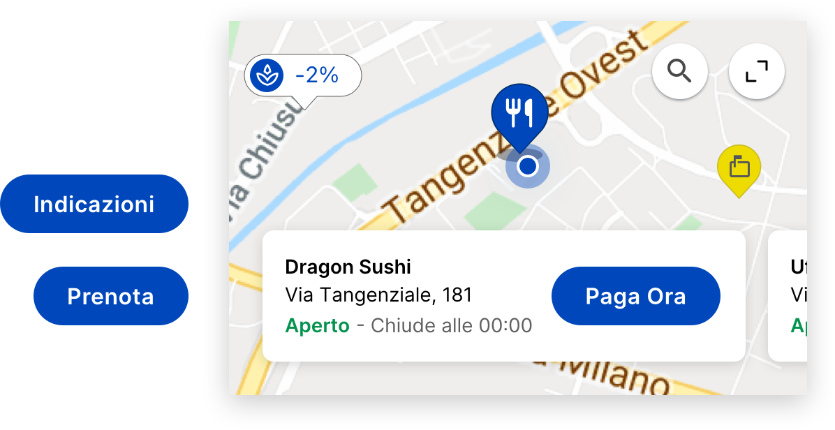
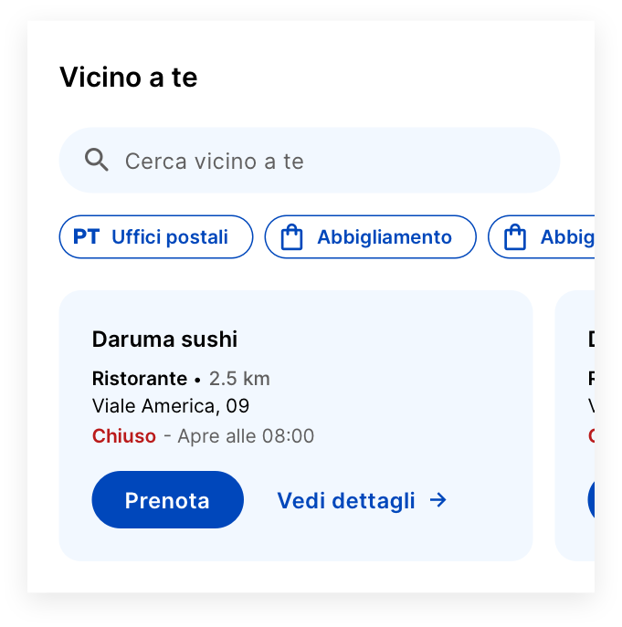
Store / Restaurant
When at a PostePay-enabled location, the "Paga Ora" (Pay Now) CTA facilitates immediate, cardless payments.
Diverse Situations
The widget adapts to individual user preferences and circumstances.
User’s Saved Postal Office
In the absence of immediate actions the user needs to take, the widget defaults to displaying the user's favorite postal office. If no favorite is set, it then defaults to showing the nearest Postal Office.
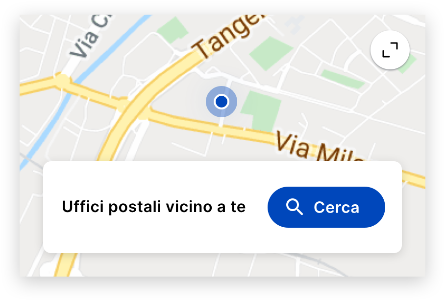
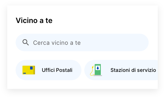
Search Card
For scenarios where the user has neither a favorite office nor a nearby Post Office, the widget presents a Search card, offering a direct pathway to search feature in Vicino a Te screen.
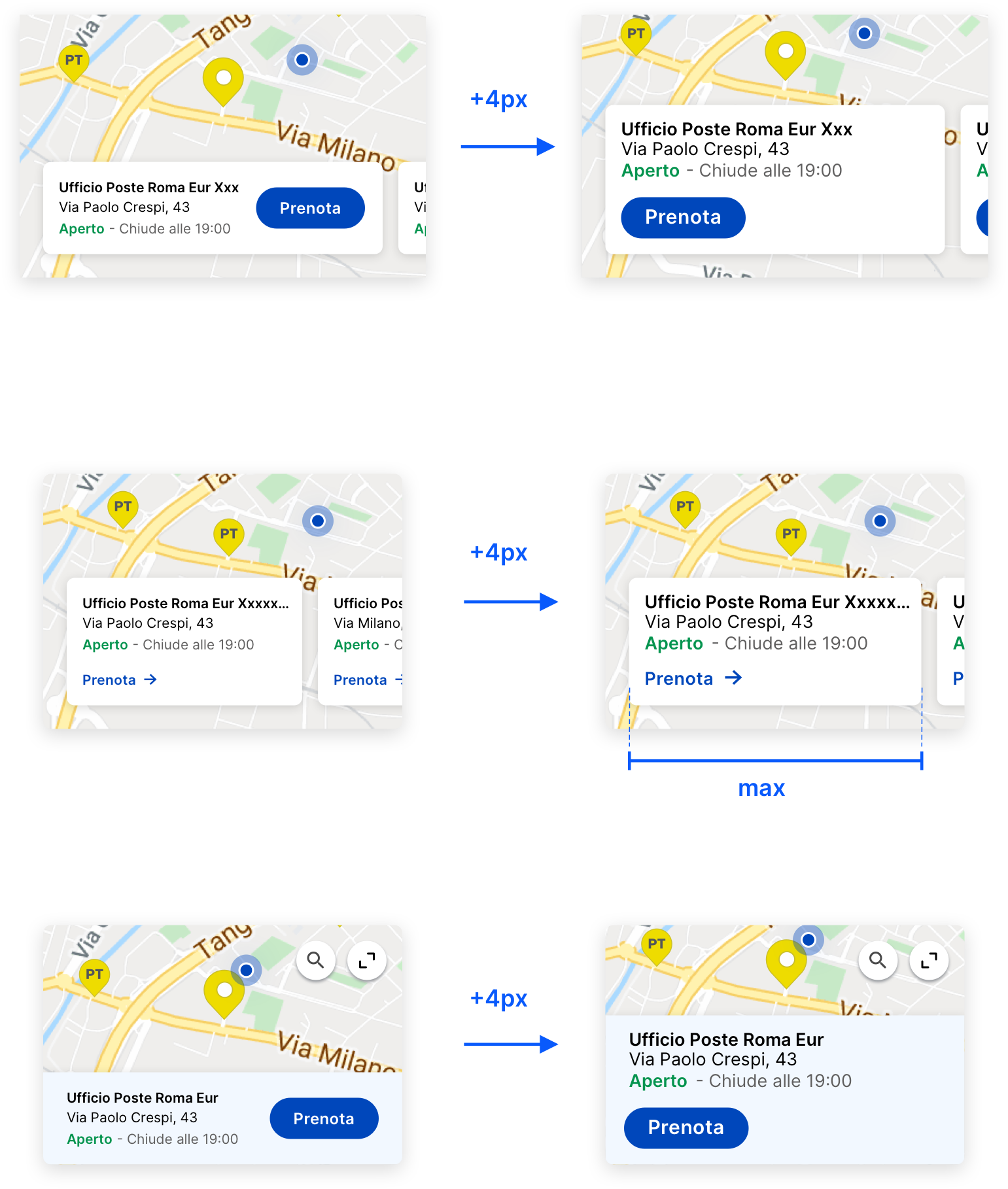
Layout Options Explored
During the design process, three distinct layout options for the same functionality were examined. The final choice was the full-width layout with integrated internal cards, selected for its user-friendly design and aesthetic appeal.
Accessibility
In designing the map widget, particular attention was paid to accessibility, ensuring that all users, regardless of their abilities, could effectively interact with it.
Screen Reader Compatibility: The widget is compatible with screen readers, with all text and CTA buttons labeled clearly for audio interpretation.
Contrast and Color: High-contrast color schemes were employed to ensure readability for users with visual impairments. Additionally, color-blind friendly palettes were selected to make the widget inclusive for users with color vision deficiencies.
Interactive Elements: Buttons and interactive elements were designed with ample size and spacing to accommodate users with motor impairments. This design choice allows for easier selection and navigation within the widget.
Customizable Display: Users can adjust text size and contrast settings within the app, making the widget more adaptable to individual visual needs.
Adaptive Design: Ensuring Accessibility through Responsive Text Size
During the design process, it was recognized that increasing text size for better accessibility led to UI responsiveness issues throughout the app, with enlarged text disrupting the layout. To address this, the widget was redesigned to be responsive to text size changes, ensuring the UI adapts seamlessly and maintains its integrity, thus providing an accessible experience without compromising on design.
Extra: Diverse Functionality and Interface Options Explored
In the process, I delved into various potential features and designs beyond the standard layout. Here's a look at some of the unique options I prototyped and considered during the design process.
Filter Chips Concept
Explored the use of chips/filters for enhanced functionality directly from the widget, ultimately omitted to maintain a lightweight homepage presence.
Customizable Access
Similar to the first, with added graphic elements and a "Gestici" (Manage) feature for user-customization. It allowed users to personalize their experience with category-specific chips, but was not chosen to avoid overloading the widget.
Functionality Without Map
An option that included all functionalities of the chosen widget, plus chips, but without the map component.
Minimalist Access Approach
A minimalist alternative without the map, this design focused on providing straightforward access to the 'Vicino a te' feature and categories, utilizing visually appealing chip graphics with colorful icons.
OUTCOME
Transforming Digital Services
The implementation of this redesigned map widget provided users with a more intuitive, responsive, and accessible way to interact with the app's key features potentially leading to increased user satisfaction and engagement. This case study outlines a journey of innovation, underpinned by a deep commitment to user-centric design principles. As the widget integrates into the One App, ready to serve millions of users, it exemplifies Poste Italiane's dedication to providing superior digital services and sets a new standard for app usability. The widget not only meets the immediate needs of users but also reflects the company's vision for a seamless, integrated service experience.
VALIDATION
Next Step: Measuring Success
At the validation stage, the design was handed over to dedicated teams specialized in quality assurance and user testing. I outlined a strategy to test the widget's performance and user satisfaction. In this project, success was defined by specific metrics that could be quantitatively and qualitatively measured:
1.
User Engagement
Increased interaction with the widget, measured by the frequency and duration of use.
2.
Task Completion Rate
The percentage of successful actions taken through the widget, such as navigating to a location or completing a transaction.
3.
Accessibility Compliance
Adherence to WCAG guidelines, verified through accessibility testing tools and user feedback from individuals with disabilities.
4.
User Satisfaction
Collected through surveys and app reviews, indicating the overall user sentiment towards the widget.
5.
Performance Efficiency
Load times and responsiveness, especially when adapting to increased text sizes, assessed through technical monitoring tools.
By tracking these metrics, the dedicated teams could evaluate the widget’s impact and effectiveness, ensuring it delivered a valuable and inclusive experience for all Poste Italiane users.
Thanks for watching