
INNER SPACE MOBILE APP:
NURTURING MINDFULNESS FOR EMPLOYEE WELL-BEING
Client
Potential Project
Sector
Mental Fitness
Scope
Product Design
Design Research
Design Library
Visual Identity
Toolkit
Figma
Photoshop
Survey Monkey
Miro
About Potential Project (Client): Potential Project is on a mission to create a more human world of work, where people thrive and find fulfillment. With a focus on understanding and managing the mind, they help individuals, leaders, and teams unlock their true potential. Their impactful solutions, delivered by experienced facilitators, have touched over 450,000 individuals in 28 countries, fostering meaningful change and inspiring new ways of working and leading.
About the Project: This project involves the creation of a transformative digital solution exclusively for the B2B market. The scope encompasses the end-to-end design of a mobile app, commencing with comprehensive research and validation of assumptions, culminating in the development of the Minimum Viable Product (MVP). The mobile app will offer short, on-demand experiences, fostering growth, well-being, and promoting a more human-centric world of work.
My Role: I joined the newly built Digital Team in 2022 as a senior full-stack product designer to lead the design process for digitalising their services creating a new mobile application from ground up. We have started defining and priotizing the scope o the app with research. I have completed the work untill completion of the development of the first version of MVP.
Note: This case study holds a unique place in my portfolio, offering a detailed view into my process and thinking. It serves to provide a rich, comprehensive showcase of my approach to work, demonstrating the depth and breadth of my capabilities in a practical context.
[ CHALLENGE ]
While Potential Project's facilitator-led programs had successfully impacted numerous individuals and organizations, the rapidly evolving digital landscape introduced new competitors. These digital solutions, often lower-priced, offered scalability and the advantage of a continuously engaged customer base. This shift in the marketplace posed an opportunity for Potential Project to innovate and expand its reach, particularly in driving sustained behavioral change at scale, a nuanced area where even established programs could find room for growth.
“In the middle of difficulty lies opportunity.” – Albert Einstein
[ GOAL ]
The primary goal was to expand the company's reach and impact while navigating the competitive challenges. The app would also address the limitations of traditional programs by empowering users with sustainable change, accessible at all times via their mobile devices.
[ DESIGN PROCESS ]
| Scope of Work / General Task
In this project, I undertook the following key responsibilities:
- UX/UI Design Leadership: Taking the lead in the design process, crafting an intuitive and visually appealing user experience for the MVP.
- Problem Validation: Validating the main problems employees face with existing solutions.
- Persona Understanding and Prioritization: Understanding personas and prioritizing opportunities and feature ideas.
- Partner Needs Integration: Collaborating closely with partners to ensure their needs were fully understood and seamlessly incorporated into the product development process.
- Development Collaboration: Working in close contact with the development team, I provided guidance and support throughout the MVP's development, ensuring a successful execution of the UX/UI design.
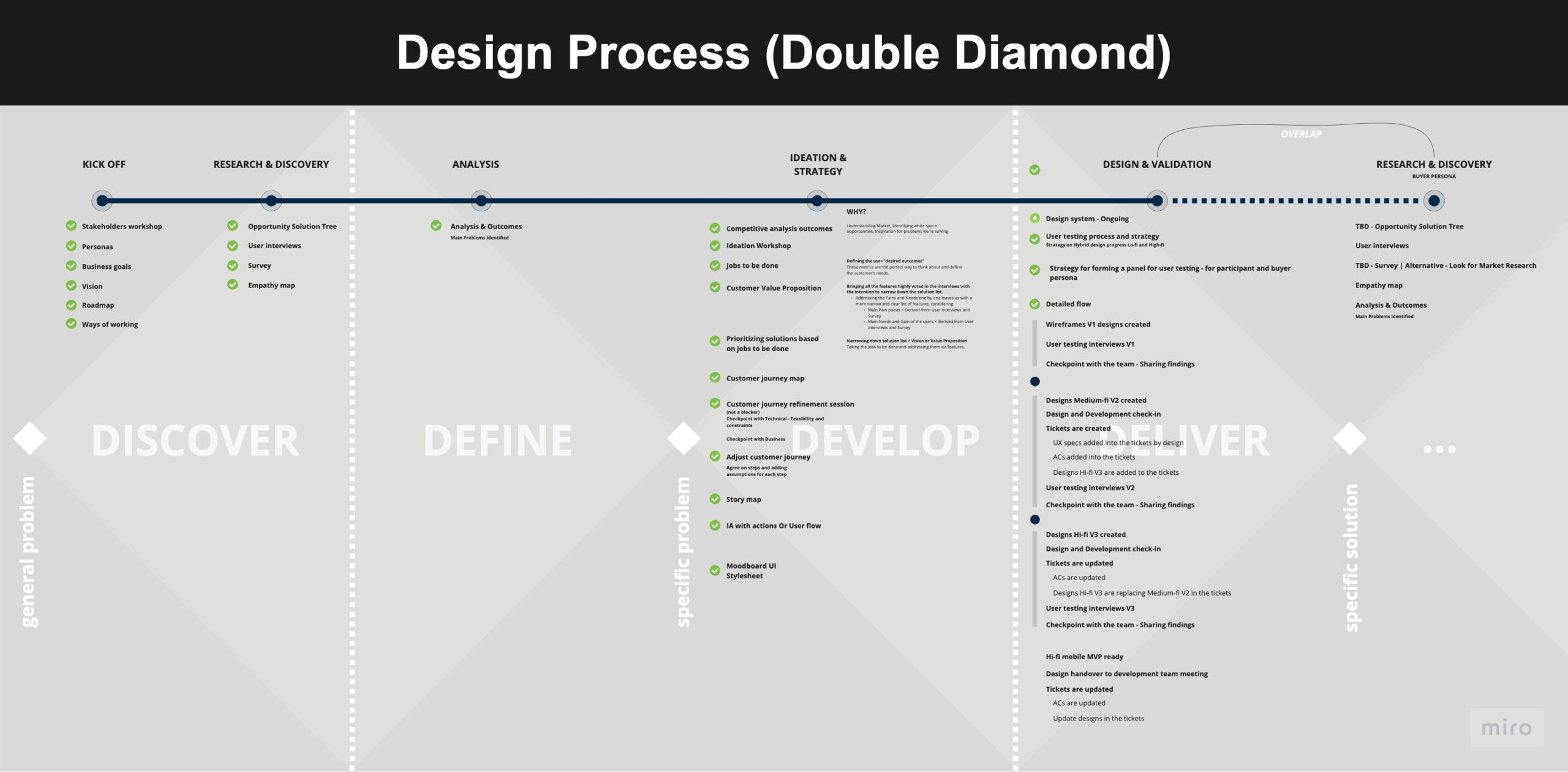
A visual representation of our design processes, drawing inspiration from the Double Diamond design framework, emphasizing research, ideation, development, and refinement.
Strategy & Executive Intent
Our strategic direction involved transitioning from program-based mindset trainings to subscription-based digital solutions. By embracing this subscription model, we aimed to attract a broader customer base compared to traditional program cohorts. The continuous nature of subscriptions would also offer us the opportunity to make a lasting impact for a growing group of subscribers, thus aligning directly with Potential Project’s growth plans.
Personal Companion for Sustained Growth:
We envisioned an empathetic approach, one that fosters a close, supportive relationship with users. The platform was designed to provide a personalized journey that adapts to various facets of an individual’s life, relationships, intentions, and emotions.
Powerful Experiences:
In the design phase, our focus was on crafting meaningful digital-to-human experiences. The aim was to establish sustainable behavior change, integrated through a thoughtful blend of technology, data, and human touch.
Target Audience
Our digital solution is crafted precisely for the B2B market, attending to the unique needs and preferences of two distinct customer segments:
Participant Segment: Employees and Team Members
Subgroups: Employees, Team Leads
Key Characteristics: This segment craves micro-moments of perspective and clarity, seeking to regain control in the fast-paced work environment. Time constraints drive their preference for short, digestible, and on-demand content that seamlessly integrates into their daily routines.
Engagement: Primarily engaged through the mobile app, turning to it for guidance, insights, and the nurturing of a more mindful approach to their professional lives.
Buyer Segment: Decision Makers such as CHROs and Learning & Development Managers
Subgroups: People Manager, Division Lead
Key Characteristics: Focused on optimizing value for their investment, these decision-makers are inclined toward solutions that offer plug-and-play implementation. Data-driven outcomes are crucial, making them eager for tangible proof of success. With often limited budgets, scaling their impact is a top priority, while data security remains a critical concern.
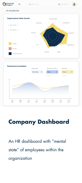
Engagement: As users and vital stakeholders, they interact with the company dashboard, leveraging it to monitor progress and ascertain the value derived from their investment.
| Research & Discovery
Our comprehensive research strategy employs a multi-faceted approach to understand, validate, and address the unique needs of our target audience. Utilizing methodologies such as the Opportunity Solution Tree, Assumption Mapping, and both Qualitative and Quantitative Research, we aim to foster a robust and transparent discovery process. Our qualitative efforts include in-depth interviews focusing on user behavior, needs, and pain points, while our quantitative initiatives harness data-driven insights to validate these findings. Through desirability testing on feature mockups, we intend to not only validate our initial assumptions but also prioritize them, thereby guiding the design and development of a product that is both user-centered and business-aligned.
Competitive Mapping
We utilized Competitive Mapping to conduct a comprehensive analysis of our competitors's strengths and weaknesses in relation to the critical problem themes pinpointed for our product. The objective was to identify areas for potential opportunity and risk, thus helping to carve out a distinct competitive advantage.
A visual representation of our design processes, drawing inspiration from the Double Diamond design framework, emphasizing research, ideation, development, and refinement.
Some Example Insights Gained from Competitive Mapping:
Insight 1: The Industry Standard of Personalization
Detail: In today's competitive landscape, personalization has become a norm rather than a differentiator. Almost all industry players are offering some level of personalization to cater to the diverse needs and preferences of their user base.
Strategic Implication: Given that personalization is a standard expectation, it is vital for us to incorporate it into our platform. However, to truly stand out, we should aim to take personalization a notch higher by understanding the deeper nuances of user preferences and creating hyper-personalized experiences that go beyond the industry standard
Insight 2: The Whitespace in Analytics and Progress Dashboards
Detail: Our competitive mapping exercise revealed a significant gap in the market when it comes to offering robust analytics and progress dashboards. Many competitors have not fully leveraged the potential of this feature, leaving a considerable whitespace in this domain.
Strategic Implication: This discovery presents a prime opportunity for product differentiation. We are poised to design a detailed and interactive analytics and progress dashboard tailored for users to glean profound insights into their developmental trajectory. By vividly visualizing their progress, users can make informed decisions for their onward growth. Furthermore, the company dashboard, exclusively accessible by management, can ensure real-time monitoring of company performance and needs.
Insight 3: The Gap in Offering Contextual Practices Focused on Work Performance
Detail: When we dissected the offerings of various competitors, we found that only Tigmun is focusing on improving performance at work, but their approach is not meditation-based. Moreover, while Headspace does offer resources on work, these are lost amidst a plethora of other content, making it less effective as a tool for workplace performance enhancement.
Strategic Implication: This insight has unearthed a significant opportunity for us. We can fill this gap by offering short, contextual practices specially tailored to enhance work performance. By offering meditation-based solutions aimed at improving work productivity and focusing on this niche, we can carve out a unique space for ourselves in the market, meeting a need that is currently underserved.
Opportunity Solution Tree
Our initial stepping stone was the Opportunity Solution Tree—a well-structured visual tool designed to clearly articulate our goals, opportunities, and an array of potential solutions. Serving as a roadmap for our discovery process, this tree-like framework starts with desired Outcomes at its roots. These foundational Outcomes give rise to opportunities, which in turn are connected to potential solutions. By adhering to this structure, we ensured that every assumption and investigative step was in alignment with our overarching objectives and, more importantly, with the nuanced needs of our user base.
Several versions of the opportunity tree were developed, with Opportunity Solution Three witnessing a significant evolution. It initially aimed at 'increasing awareness throughout the day', but eventually shifted focus towards 'maximizing time spent practicing'.
Assumption Mapping
Building upon the assumptions generated in the Opportunity Solution Tree, Assumption Mapping helped us identify and prioritize which assumptions warranted further investigation. This methodology distinguished test-worthy assumptions from those of low impact or already known high impact, thereby streamlining the focus for our subsequent user interviews and tests.
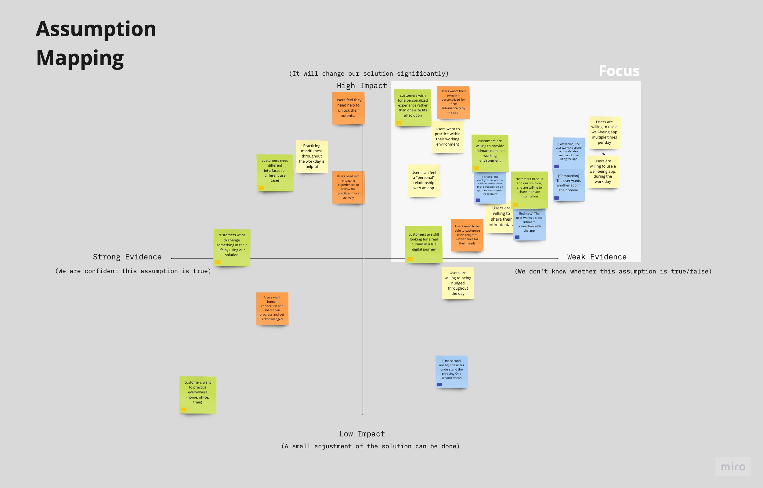
Assumption Mapping: Prioritizing assumptions in the high-impact, weak-evidence quadrant for testing.
Interviews with Participant Segment
(Employees, Team Members)
In the pursuit of a richer qualitative understanding and guided by our assumption mapping, we initiated a series of interviews with potential users falling within our identified participant segment. The endeavor was to foster a multi-dimensional dialogue, with the objectives to:
- Validate and explore assumptions that were prioritized through Assumption Mapping.
- Gain a comprehensive understanding of user needs and pain points.
- Uncover potential challenges or barriers to product adoption.
- Prioritize features based on user preferences and needs.
- Understand the competitive landscape from the users' perspective
- Gain insights from users’ experience with similar products
- Gather feedback on specific potential features or functionalities of the product.
Part 1: Exploratory Dialogue
In the initial phases of each interview, we opened a dialogue to delve into the intricacies of the participants' professional lives. Our discussion was segmented into four core areas:
1- Challenges Faced:
We probed into the issues participants encounter daily, specifically focusing on stress, burnout, communication difficulties, and concentration lapses.
“I struggled with consistency.”
2- Coping Mechanisms:
We gained valuable insights into the strategies and methods these individuals employ to mitigate these challenges.
“Having friends to motivate each other works for me. Also having some competition between friends.”
3- Experiences with Existing Solutions:
For participants who have tried apps or other tools in our domain, we assessed their experiences to understand what works and what doesn't.
“Planing what to do this weak using a Trello Board helps me. I plan there different activities to get out of work such as yoga, meditation...”
4- Barriers to Adoption:
For those who had not engaged with similar apps, we explored the reasons behind this lack of engagement.
““ didn't see results right away and I didn't like that.”
Part 2: Assumption Validation
Building on this foundational understanding, we introduced a set of problems closely related to our prioritized assumptions. Participants were invited to evaluate the relevance of these issues to their own experiences. This methodology enabled us to validate our assumptions with users and further prioritize them, thereby informing the trajectory of our digital solution development.
Example Assumptions that We Presented to Users for Validation:
“I have little time to devote to self-development”
“I'd like to be inspired by experienced role-models”
“I have difficulty in habit change”
“I have difficulty seeing real change & progress”
Example Actionable Insight:
The assumption that users experience loneliness during their learning and development phases, and thus could benefit from a feature facilitating social interaction to enhance motivation, did not resonate as strongly with the users as anticipated, consequently placing it lower on the priority list.
Part 3: Desirability Testing
Before conducting the interviews, we prepared mockups for a variety of potential features targeting different user challenges. Based on the issues highlighted by each interviewee, we tailored the subsequent presentation of these mockups to specifically address their concerns. These mockups formed the basis for our desirability tests, allowing users to evaluate feature effectiveness, identify high-impact features, and offer improvement suggestions.
Importantly, we carried out this desirability testing as the concluding activity in our interview process. This approach ensured that the feedback received earlier in the dialogue remained uncolored by our proposed solutions, thereby preserving the integrity of our qualitative research.
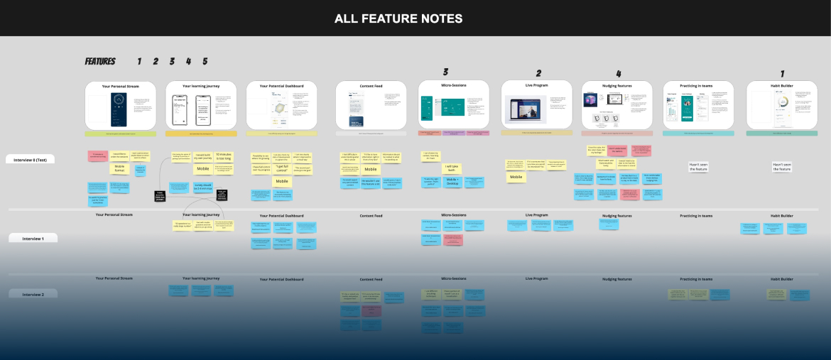
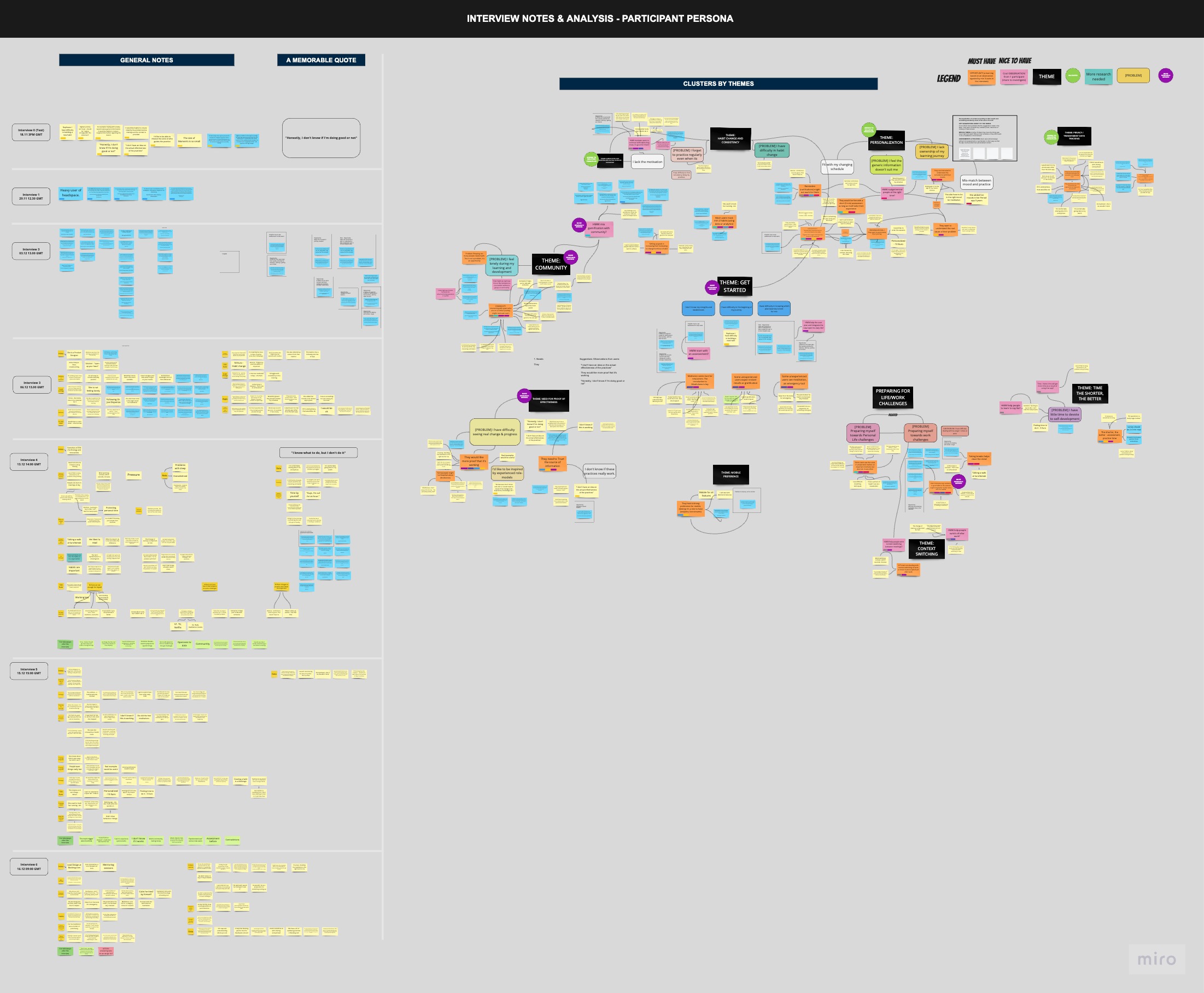
An aggregate of user comments from interviews, providing insights on various potential features.
Specific Example:
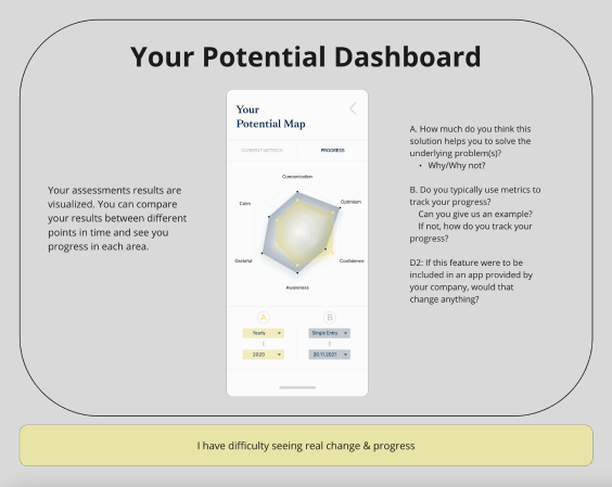
Feature Feedback Snapshot: A detailed view of user responses to one specific feature, sourced from the comprehensive feedback compilation above.
User Comments on the feature:
“I want to set a target looking at this.”
“I want to be able to change the dimensions like calm, optimism ...”
“I can see clearly where I improved in a visual way”
“The second part (history) is the gem”
“Possibility to see where I'm growing”
“In this way, I have full control over my progress”
Interviews with Buyer Segment
(CHRO, Learning & Development Manager)
Selection of Interviewees:
To ensure a rich and relevant pool of insights, we reached out to individuals from our partner companies with whom we already had established relationships. This approach allowed us to select interviewees who were not only decision-makers in their respective organizations but also had a deep understanding and experience with tools in our domain.
Objective:
Within this collaborative framework, we initiated a series of interviews to delve into the precise needs, concerns, and preferences of these vital stakeholders who hold pivotal roles, including CHRO and Learning & Development Managers. These individuals, vested with decision-making powers, have a dual role, being users of the company dashboard as well as critical stakeholders shaping the purchase decisions. Through these interviews, we aimed to:
- Understand the organizational challenges and needs related to employee well-being and productivity.
- Uncover their primary concerns and preferences when selecting a similar digital solution.
- Gain insights into the criteria and features that they consider most valuable in evaluating the success of a tool.
- Understand their budget constraints and security concerns.
Outcome:
From the interviews, we distilled several key insights:
- Data Presentation and Regulations: Understanding the precise level of data aggregation necessary for the company dashboard is vital, taking into account varying international regulations. A strategy respecting regional norms and legal frameworks is essential.
- Preference for Research-Backed Solutions: The predilection for evidence-based programs was evident, leveraging positive experiences with platforms like Headspace and Healthy Mind App. This points to a need for our solution to be substantiated by credible research.
- Security Concerns and Data Handling: The discussions emphasized secure and ethical data handling. The favored approach is housing user data on our servers while granting companies access to aggregated data, paired with clear communication to build trust.
Analysis After Interviews
After conducting numerous interviews with individuals who fit our participant and buyer profiles, we undertook a structured analysis to organize the rich but complex data we gathered. By employing a well-thought-out grouping methodology, we successfully synthesized multiple interview findings into coherent themes and patterns. This structured approach helped us put the pieces together in a meaningful way and set a strong foundation for the subsequent design and development phases.
This methodology not only served as an analytical tool but also as a catalyst for idea generation within the solution space. As the team organized and reviewed the consolidated findings, we found ourselves generating additional ideas that could further enrich our transformative digital solution.
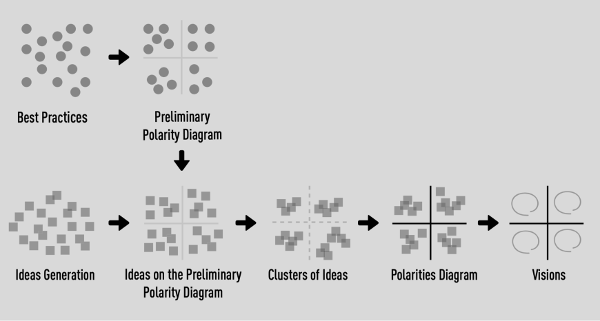
This visualization delineates the method employed to distill and organize a substantial volume of data, simplifying its complexity step by step. The process unfolds as follows (Credit: Carlo Vezzoli, Cenk Basbolat):
(1) Crafting an initial polarity diagram grounded in case study analysis.
(2) Allocating the gleaned information onto the established polarity diagram.
(3) Further segmentation of ideas into cohesive clusters unified under distinct themes.
(4) If warranted, revising the initial polarity diagram to foster a rejuvenated vision, facilitating a nuanced understanding of the landscape
This depicts the modified refined version of the previously outlined methodology. Initially, data is segregated into predefined thematic categories, followed by the organic cultivation of new, emerging clusters within those realms.
Deciphering User Feedback: Beyond Face Value
In our post-interview analysis, we approached user comments with an astute awareness of the diverse user types and personalities behind the feedback. Recognizing that our application would cater to a mosaic of user groups, we practiced caution in weighing the sentiments shared. A negative or positive comment about a specific feature doesn't necessarily equate to an inherent flaw or merit. More often, such feedback underscores the distinct needs of varied user segments.
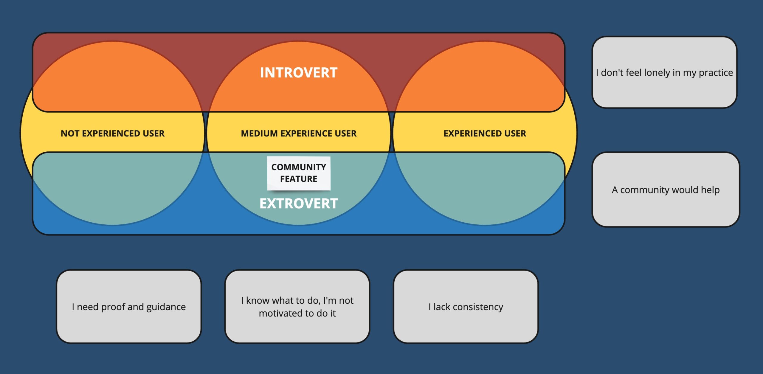
The diagram illustrates how the Community feature resonates more with Extrovert users possessing a medium familiarity with meditation / mindfulness practices. It also maps out the alignment between various user comments and their respective user groups concerning this feature.
Quantitative Research
To complement our qualitative efforts, our quantitative research set out to achieve multiple objectives. We aimed to measure and analyze trends directly related to our transformative digital solution, as well as to quantitatively validate the findings from our qualitative phase. This dual approach reinforced the rigor and validity of our comprehensive research methodology.
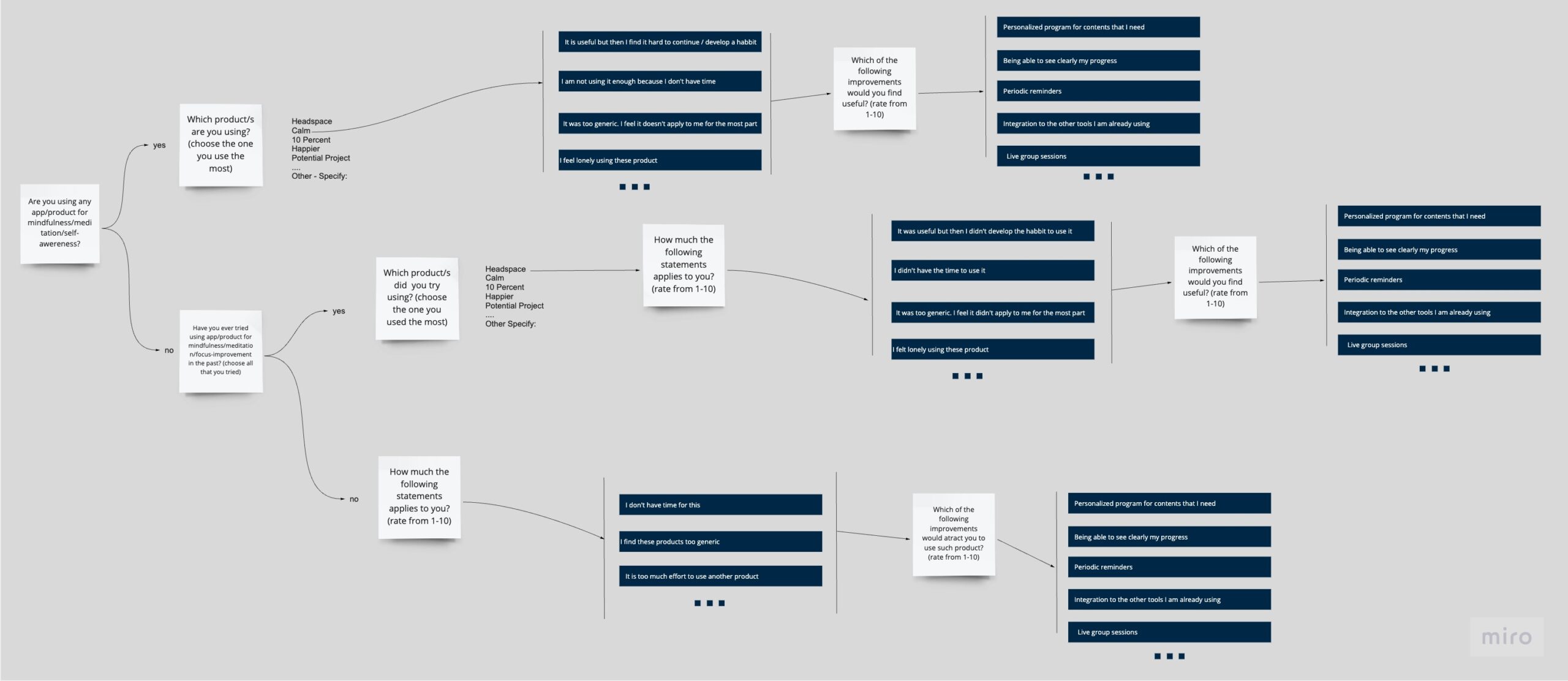
The diagram illustrates the preliminary draft of the questionnaire, strategically designed to garner maximum insights from various user groups categorized based on their interaction level with similar apps. The categories include new users for exploring the barriers to entry, individuals who have ceased usage to understand the reasons behind discontinuation, and active users to pinpoint the strengths of competitive products in the market.
To gather this data, we administered surveys via the Survey Monkey platform. Below are a detailed breakdown of the key findings from the participant and buyer segments.
Participant Segment Key Findings
App Utilization Trends
- 76% have used a relevant app in the last two months.
- 43% use it daily, while 33% utilize it several times a week.
Challenges Faced While Using the Apps
- Top issues include difficulty in building a habit, forgetting regular practice, and uncertainty about the correct way of practicing.
- Distraction, lack of time, and feeling that the app sessions are a chore were also significant concerns.
Feature Preferences
- High demand for a progress dashboard, personalized recommendations, and the ability to tailor their learning journey.
- Desire for a feed of quality research information and short guided practices for specific work challenges.
Reasons to Start and Stop Using the Apps
- Main triggers to start were to reduce stress and enhance focus.
- Ceasing usage was primarily due to forgetting to use the app, dissatisfaction with progress, and repetitive content.
App Choices
- Calm (46%) and Headspace (43%) were the most preferred apps, with Calm slightly edging out in terms of content personalization and helping to track personal development.
Buyer Segment Key Findings
Leadership Development Program Aspirations
- Managers aspire to enhance self-leadership, embrace agility, and foster work-life balance through the program.
- They desire to mitigate stress and delineate work from personal life clearly.
Expectations from a Leadership Development Program
- Managers seek fresh, goal-oriented content that connects humanity with performance.
- There is a pronounced preference for easy, actionable, and practical techniques with a measurable impact on their growth.
Challenges Faced
- Before: Concerns revolve around the time investment and the actual utility of the program.
- During: Commitment to practices and translating intention to action appear as considerable hurdles.
- After: The post-program phase sees challenges in maintaining momentum and integrating learnings without continual support.
Inspirations and Motivations
- The program’s inspirational aspects lie in providing space for reflection and nurturing life-changing insights.
- Managers value the practical, non-spiritual application of the learnings and appreciate acquiring new perspectives to address challenges.
By sifting through the rich data gathered from participants primarily from the US and various managers and leaders, we have unearthed patterns and preferences that hold the key to a successful digital solution. The insights drawn from both segments underline the need for a solution that is user-centric, with a strong focus on practicality, personalization, and evidence-based content, ensuring the users feel supported and see tangible growth through their journey. Furthemore, the alignment between these quantitative findings and our qualitative insights reinforced the reliability of our overall research, instilling confidence within both the team and the wider organization to act upon these results.
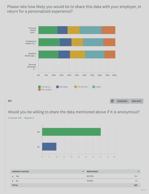
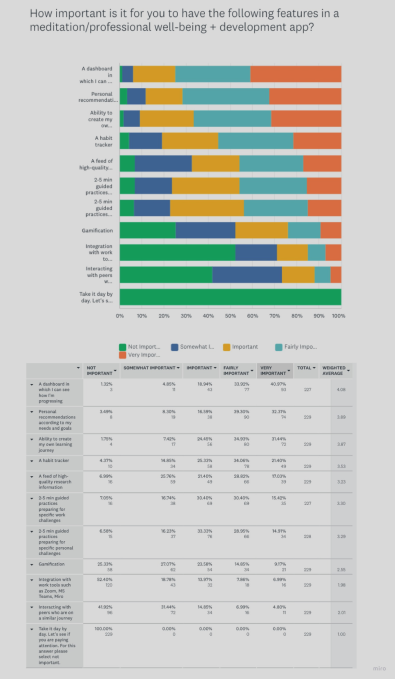
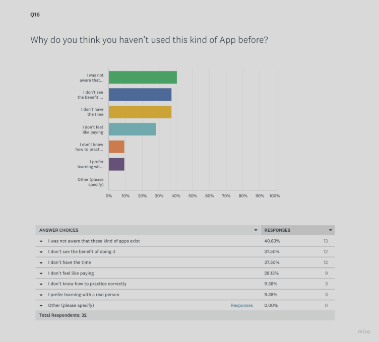
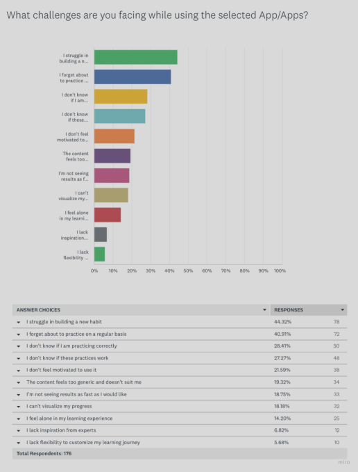
Snapshot of Key Findings: This visuals presents screenshots capturing pivotal responses from our Survey Monkey questionnaire, offering a glance into the valuable data derived from some of the key questions.
The insights underline the need for a solution that is user-centric, with a strong focus on practicality, personalization, and evidence-based content, ensuring the users feel supported and see tangible growth through their journey.
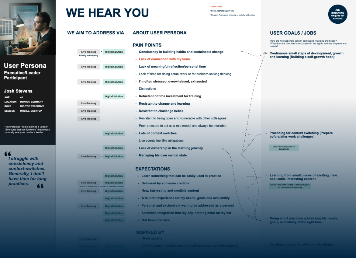
Define Persona
We crafted user personas to bring our target audience to life, helping us focus our design and development efforts around their specific needs and preferences.
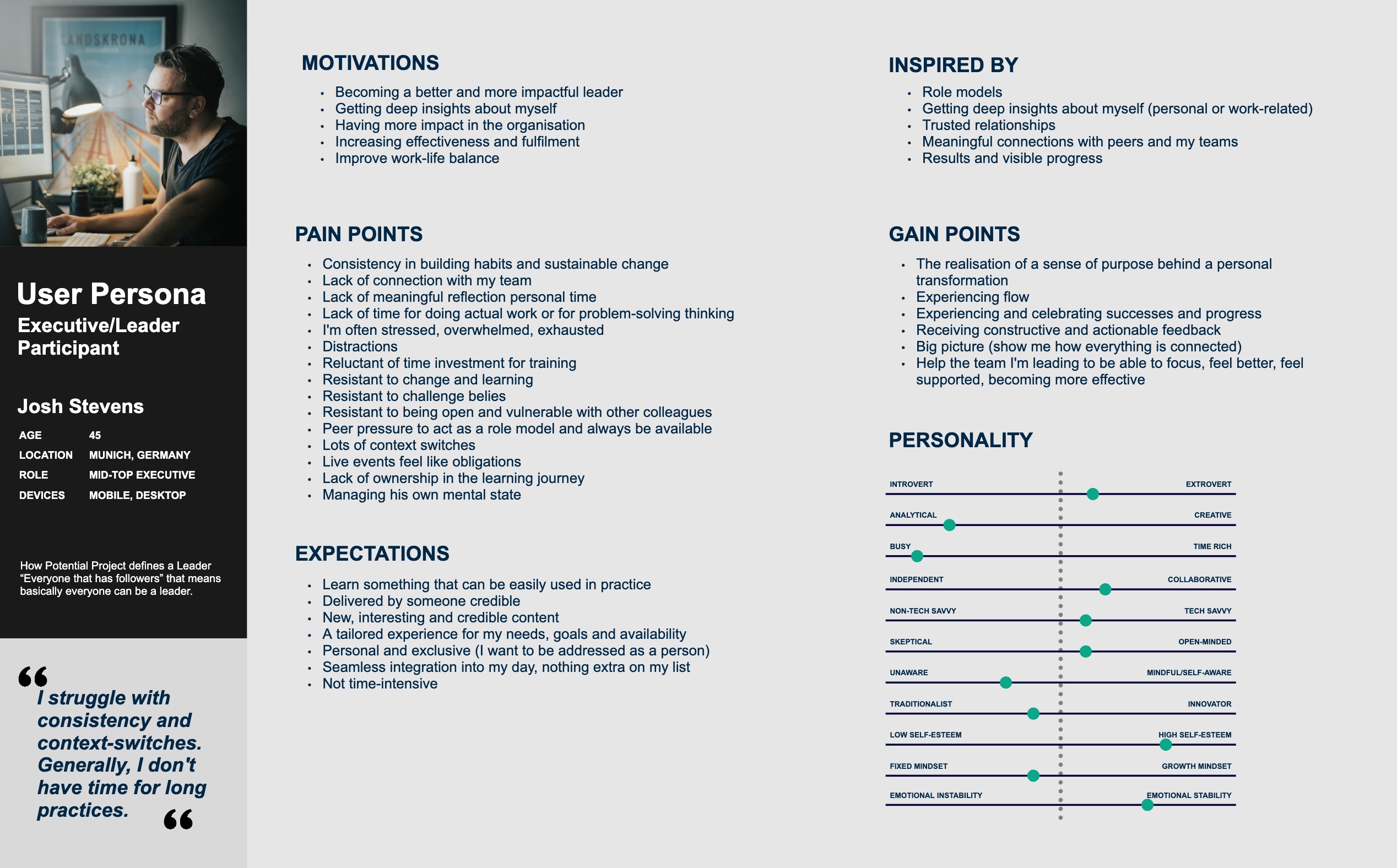
Addressing User Persona’s Needs
After creating the personas, we also took the additional step to map out how our solution would meet the needs of these personas.
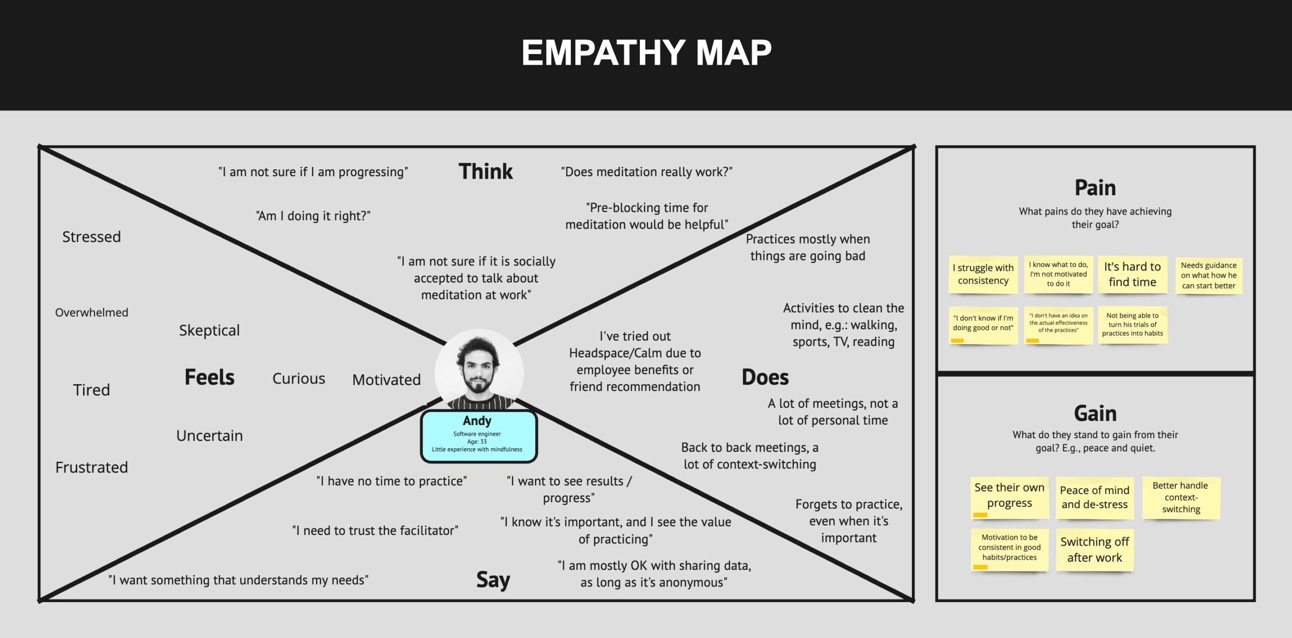
Empathy Mapping
Empathy Mapping provided us with a deeper understanding of our users' emotional landscape, which has been invaluable for identifying additional customer needs and strengthening our relationships with them.
Defining Core Functionalities
During this stage, led by the Digital Solution Manager, we outlined the essential features for our Minimum Viable Product (MVP), based on research results, business goals and feasibility. This involved a collaborative approach with a cross-functional team to identify and prioritize functionalities critical for the initial release.
Click and drag horizontally to navigate in the gallery.
Swipe left or right to navigate in the gallery

User Journey
As an integral part of our research strategy, our team methodically developed an in-depth user journey to fully capture our customers' experiences. From the first point of interaction to the final outcome, we carefully anticipated about each user's thoughts, emotions, and interactions. The insights derived from this exercise did more than simply highlight areas for improvement; they steered us toward creating a more captivating and satisfying user experience.
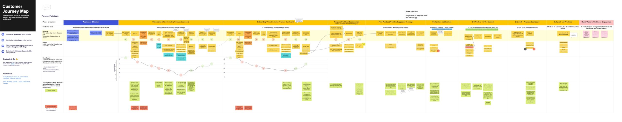
User journey map above depicts a version of the onboarding process. After monitoring the users' emotional scores, we noted a substantial drop when they were asked to complete a personalization test immediately post-registration, falling below our acceptable threshold.
To prevent overwhelming new users and risking app abandonment, we revised our approach: the personalization test became optional, letting users decide the best time to take it. This change aims to maintain user interest while offering a customized app experience at a pace comfortable to them.
User Flow
Building upon the defined core functionalities, this stage involved crafting an initial, adaptable user flow. While this flow serves as a robust framework for planning and accurate estimation in future processes, it remains flexible. As we transition into designing based on actual user stories, it will undergo further refinement and iteration.
Our user flow blueprint serves as a proactive tool, guiding us in anticipating user interactions, identifying potential roadblocks early on, and ensuring a seamless user experience.
Prototyping
In this phase, we brought our digital solution to life in a preliminary form to visualize the user experience, initiating with simple flow outlines and culminating in high-fidelity mockups. This gradational approach not only enables us to identify various concerns timely and from diversified perspectives facilitating an efficient problem-solving approach but also promotes a comprehensive view of the product in both macro and micro dimensions. It should be noted that while the outcomes from this stage will pave a defined pathway forward, they remain exploratory flexible and open to refinements; and will be fine-tuned in subsequent stages to be ready for development based on the specific user stories.
Alignment with Research Insights: Throughout the prototyping process, we made a concerted effort to constantly refer back to the research insights, ensuring that the experience we were creating were not just intuitive, but deeply aligned with the needs and preferences identified during the research phase.
- For prototyping, we utilized:
Wireframes: We employed a blend of Balsamic and Figma to create fundamental visual drafts that delineate the app’s structure and navigation without diving into intricate design specifics. They served as the skeleton of our prototype. - Interactive Prototypes: Using Figma, we created interactive prototypes that allowed first of all our team and then, stakeholders and potential users to experience the flow of the app dynamically, facilitating the collection of early feedback.
- User Testing with Prototypes: Before moving to high-fidelity designs, we tested our prototypes with a small group of potential users to glean initial reactions and understand areas where the user experience could be further enhanced.
- Iterative Process: An iterative approach was adopted, wherein feedback was actively sought and used to refine the prototypes continuously.
This stage is instrumental in visualizing the user’s journey in a realistic framework, offering a glimpse into the final product’s functionality and aesthetics. By nurturing a symbiotic relationship between the user and the design, we foster a platform ready for comprehensive testing and further refinements, ensuring a product that is not only usable but delights at every touchpoint. It is the bridging point between ideas and reality, making the intangible, tangible while laying a robust foundation for subsequent stages.
My prototyping process is both exploratory and evolving, setting the ground for deeper insights and richer user-centric design as we advance. It is a dynamic space where creativity meets structure, balancing innovative, lab-like experimentation with methodical refinement of the most promising directions.
Roadmap
Guided by our Product Owner and Digital Solution Manager, we crafted a roadmap to outline the trajectory of our project. This roadmap is more than just a schedule; it’s a strategic plan highlighting the phased development of our product. Our goal was to remain committed to nurturing a product that is not just user-friendly, but continually evolves to offer a richer, more immersive experience, staying aligned with the changing landscapes and emerging user needs as we traverse this roadmap.
Our goal was to remain committed to nurturing a product that is not just user-friendly, but continually evolves to offer a richer, more immersive experience, staying aligned with the changing landscapes and emerging user needs as we traverse this roadmap.
| Translating User Stories into Design and Delivery
Following stages have been undertaken in parallel to the development. I have created a process to allow the team to work efficiently, providing the development team with the required design while at the same time planning and working on future deliveries in a loop as cycled through sprints.
User Stories to Design: A Synchronized Workflow
Continuous Delivery from One User Story Round to the Next
In steering the development of the mobile application, I fostered a dynamic and continuous workflow, orchestrating a harmonious transition from one user story round to the next, keeping a steady pace in a synchronized environment.
Each round is initiated by delineating user flows, swiftly moving to the creation of mockup designs grounded in the freshly curated user stories. Parallelly, a meticulous process unfolded where I fostered iterative UI design, constantly refining based on user testing results, fine-tuning the language during copy reviews, and ensuring universal accessibility through dedicated reviews.
This parallel workstream allowed for the development team to work on the ready screens while I spearheaded the upcoming user story’s pre-production tasks, ensuring an uninterrupted, coordinated progress among all team members and the delivery cycle. It was a cohesive process, a cycle showcasing adaptability and foresight, facilitating swift transitions from one user story round to the next, always a step ahead, ready to delve into the next sprint with well-articulated strategies grounded in learnings from the preceding rounds.
Visualizing the Design Process in Sprint Cycle: A systematic approach fostering adaptability and continuous progress, facilitating seamless transitions between each cycle while attending to every vital design detail.
User Task Flow
In this stage, we created a narrative for each screen stemming from our user stories, utilizing a format that illustrates what the "User sees..." and what the "User does...". This process laid the groundwork for the low-fidelity mockups, offering a preliminary visualization of the user's journey through the app.
This is perhaps one of my favorite UX tools because it fosters an environment where we could swiftly iterate and find optimized pathways. Pinpointing essential elements and opportunities for enhancements early on, it sets a solid foundation for the design stages that follows, thereby conserving time in subsequent, more elaborately defined design stages.
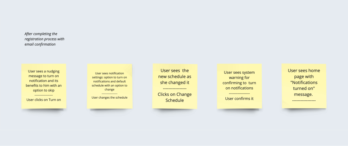
I prefer task flows that are simple, focused on a single task without branching. Multiple possibilities can be explored quickly and multiple such flows can be created for various tasks as needed. In the comparison depicted above, you can observe the initial task flow and its subsequent transformation into high-fidelity mockups.
Low-Fidelity Mockups
In this stage, we transform our User Flows into low-fidelity mockups, presented as initial rough sketches. These serve multiple purposes: they provide a preliminary visual structure, enable quick iterations, and facilitate early-stage feedback from stakeholders, our team, and notably, the development team. When necessary, these mockups are also employed for prototyping and preliminary user testing. Once a consensus is reached among all stakeholders, we transition to the next phase, which involves creating high-fidelity UI designs.
Examples of the low-fidelity mockups utilized. A glimpse into the embryonic stage of the onboarding process, sketched with attention to fostering a user-friendly introduction to our app.
UI Design
After the low-fidelity mockups were approved, I progressed to the UI design phase. Here, my focus was on synthesizing the aesthetic elements with the functional requirements to sculpt a user-centric design that doesn’t just look good but works seamlessly. Here, I transitioned from the basic structures we had in the low-fidelity mockups to high-fidelity designs that were both visually appealing and user-friendly, echoing our brand's ethos.
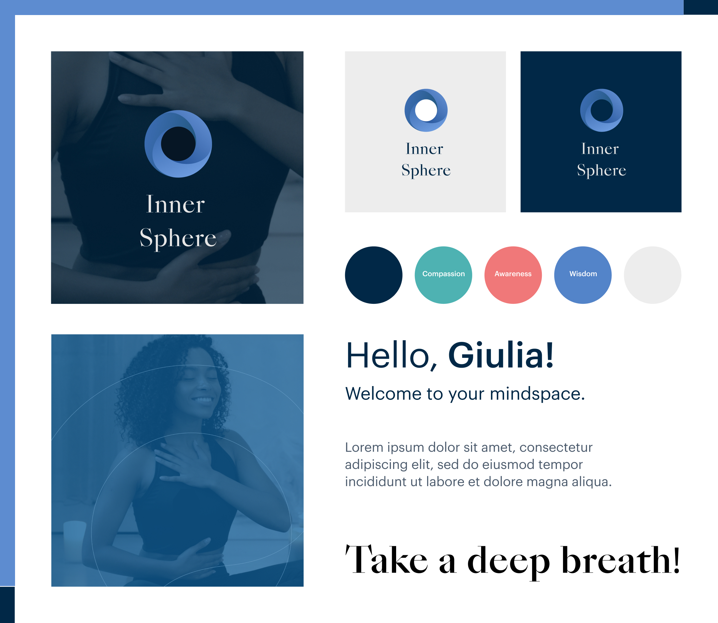
Micro-Branding
Within this framework, I initiated a micro-branding venture for the mobile application, inheriting foundational elements like fonts and colors from the overarching Potential Project brand to ensure coherence and a visual connection with the parent brand. This endeavor was meticulous and would warrant a detailed exploration in another case study; however, it laid down a robust branding foundation for the app, attributing it with a distinct identity that aligns with our digital vision and resonates well with our targeted user base.
Design Library: Atomic Design Methodology
While working on the UI design phase, I simultaneously adopted the Atomic Design Methodology to construct a Design Library, a centralized repository of reusable UI components including buttons, cards, and form fields. This methodology approaches design as a collection of interconnected parts, organized hierarchically from atoms (the foundational building blocks like buttons or input fields), to molecules (groups of atoms functioning together), organisms (complex, multifunctional sections of a user interface), templates (page structures where we define the organism layout), to pages (the complete instances populated with content).
The integration of Atomic Design Methodology not only facilitates the systematic categorization and reuse of UI elements but also ensures a harmonious relationship between micro and macro perspectives of the system, streamlining the design-to-development workflow. This resource not only fostered efficiency but upheld design consistency, thereby fortifying the relationship between the design and development spheres.
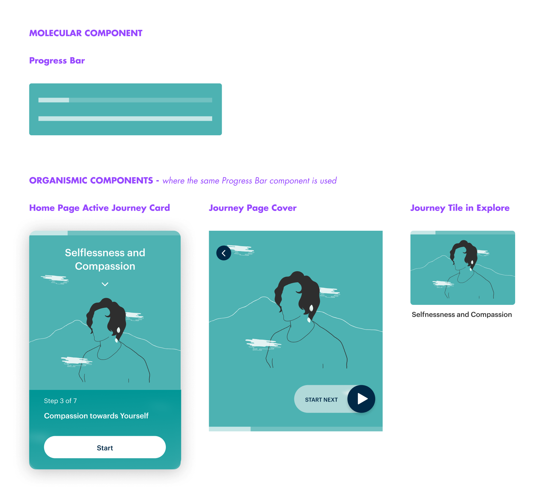
An exemplary undertaking during this stage was the conceptualization of a versatile progress bar. Crafted to adapt across diverse sections of the app, it not only reduced the development workload but amplified efficiency and fostered visual consistency significantly. This agile approach to design, focusing on reusability and consistency, should enable a smoother, more harmonized user journey.
Team Review and Refinements
Every week or bi-weekly, we gather the entire team, including developers, for collaborative review sessions. These sessions are pivotal in fostering alignment among all stakeholders by incorporating diverse perspectives and expert feedback into our evolving designs. This routine not only ensures the functionality and technical feasibility of our designs but also nurtures a shared vision, laying the groundwork for a seamless development phase and optimizing the design progressively.
User Testing
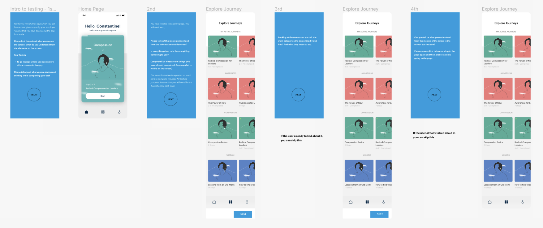
Once we've integrated the feedback obtained during our team reviews into our designs, we transitioned to user testing. Using Figma, we built interactive prototypes to mimic realistic user interactions. Testing sessions were conducted online, utilizing Microsoft Teams to record both the interactions with the prototype and the user's facial expressions.
Every user testing is different and designed to find answers to questions unique to a specific case. Below is an example set of questions we start with designing user testing.
The questions for us to consider testing for the Explore page:
- Do users understand that Awareness, Compassion and Wisdom are the 3 main areas around which all of the Journeys are built?
- Do users expected the Journeys to be organized from left to right? Easy to hard? Is there an order? Is it at random? Can I do them in any order?
- Can I do Journeys again?
- Is there a way to signal my favorite Journeys?
- Do users understand/recognize there is a color associated to Awareness, Wisdom and Compassion?
- Do users understand they can click to go to Journey Overview?
- Is there an expectation to play ongoing Journeys directly from the explore page?
- Can users quickly find what is interesting/relevant to them?
- Would users prefer an option of filtering? What filter options would be relevant?
- Can users see clearly enough the progress they have done in the journeys?
- Do users expect to see active journeys repeated in the lower sections (Awareness, Compassion and Wisdom)?
Once we've integrated the feedback obtained during our team reviews into our designs, we transitioned to user testing. Using Figma, we built interactive prototypes to mimic realistic user interactions. Testing sessions were conducted online, utilizing Microsoft Teams to record both the interactions with the prototype and the user's facial expressions.
Every user testing is different and designed to find answers to questions unique to a specific case. Below is an example set of questions we start with designing user testing.
These methodical tests provided us with invaluable insights into user behavior and preferences, guiding us towards design enhancements for a more intuitive user experience. Below are a few instances showcasing how user feedback elevated our design.
Example Design Iteration:
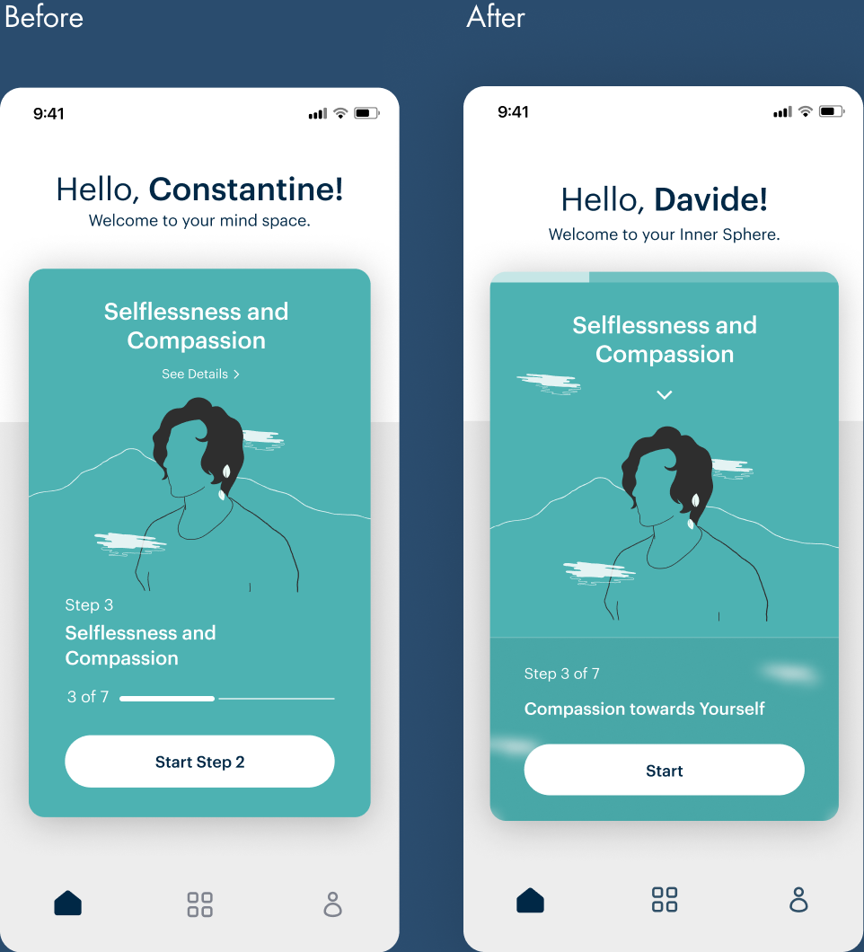
The progress bar transitioned to a more streamlined version, emphasizing completed steps rather than current positioning, aligning better with user expectations.
To avoid redundancy, we curtailed the repetition of step numbers. We enhanced the visual distinction between information about a 'Step' (a session within the journey) and the overarching journey card to underscore their relationship and distinction.
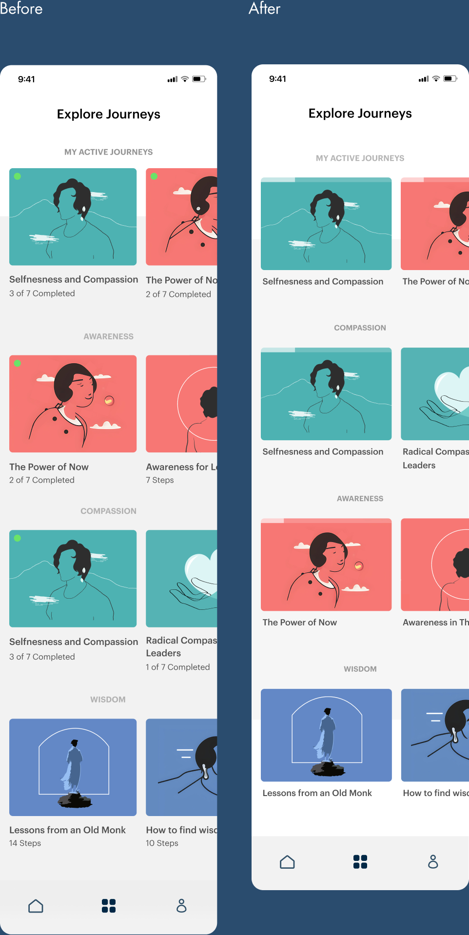
We replaced the green dot (indicating an active journey) and detailed step information with a streamlined progress bar, which effectively conveyed the same data. We realized that the exact step count was not pivotal on the discovery page as it seldom influenced a user's journey choice. The minimized information successfully reduced cognitive load, allowing users to concentrate more on exploring topics to find their ideal journey.
UI Handover
After completing all design and testing phases, we proceed to the UI Handover. This entails assembling all design assets, specifications, and relevant documentation required for the development team to accurately execute our rigorously-tested design.
After the development team completes their work, they first share a video capturing the interactions within the newly developed section for the design team's review and feedback. Subsequently, the finished section is transferred to TestFlight, where it undergoes one more round of analysis by the design team, with a possibility to interact with and test the design directly on a mobile device.
A glimpse into the first released version showcased through TestFlight.
[ PRESENTING THE PRODUCT]
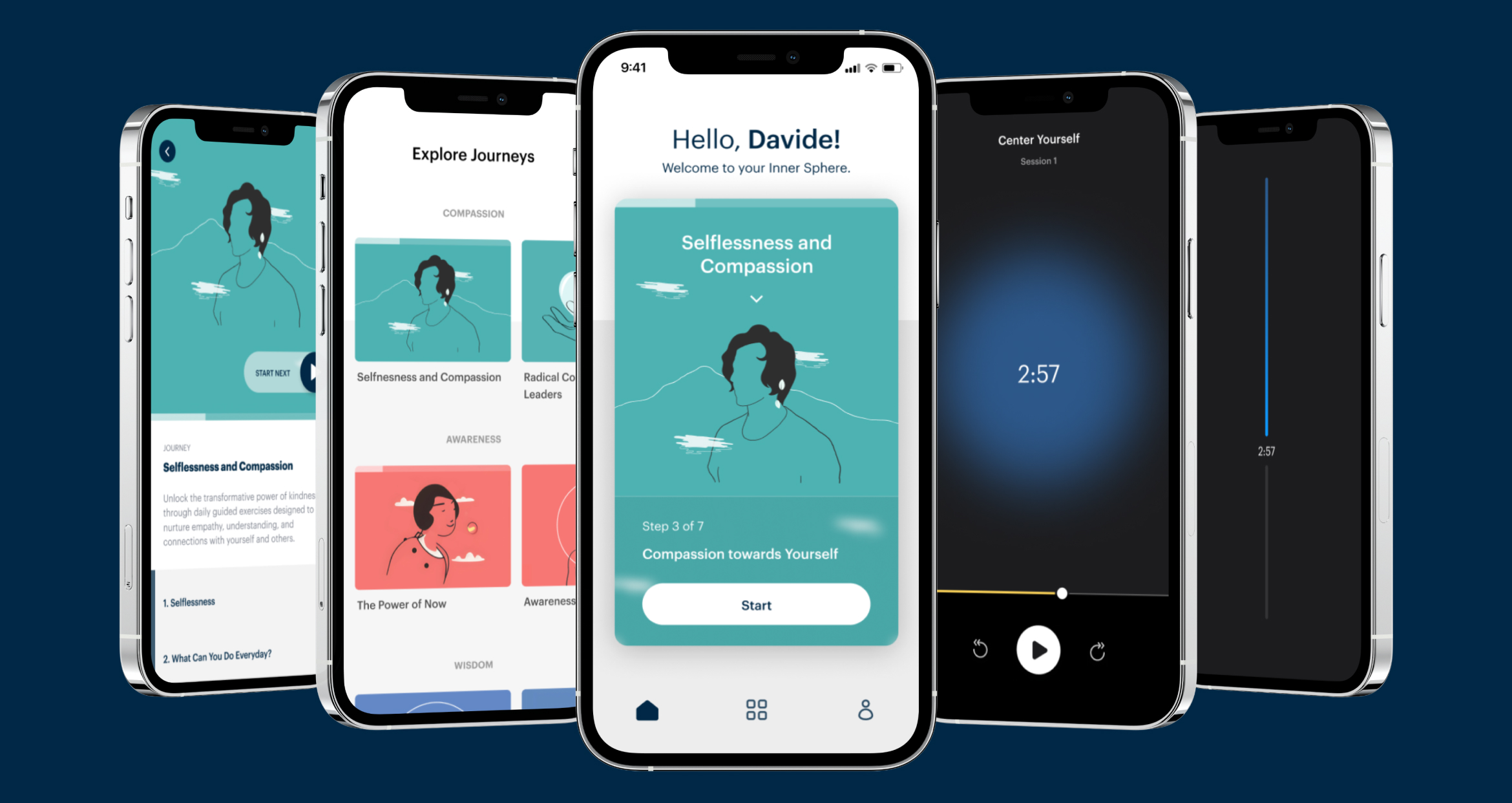
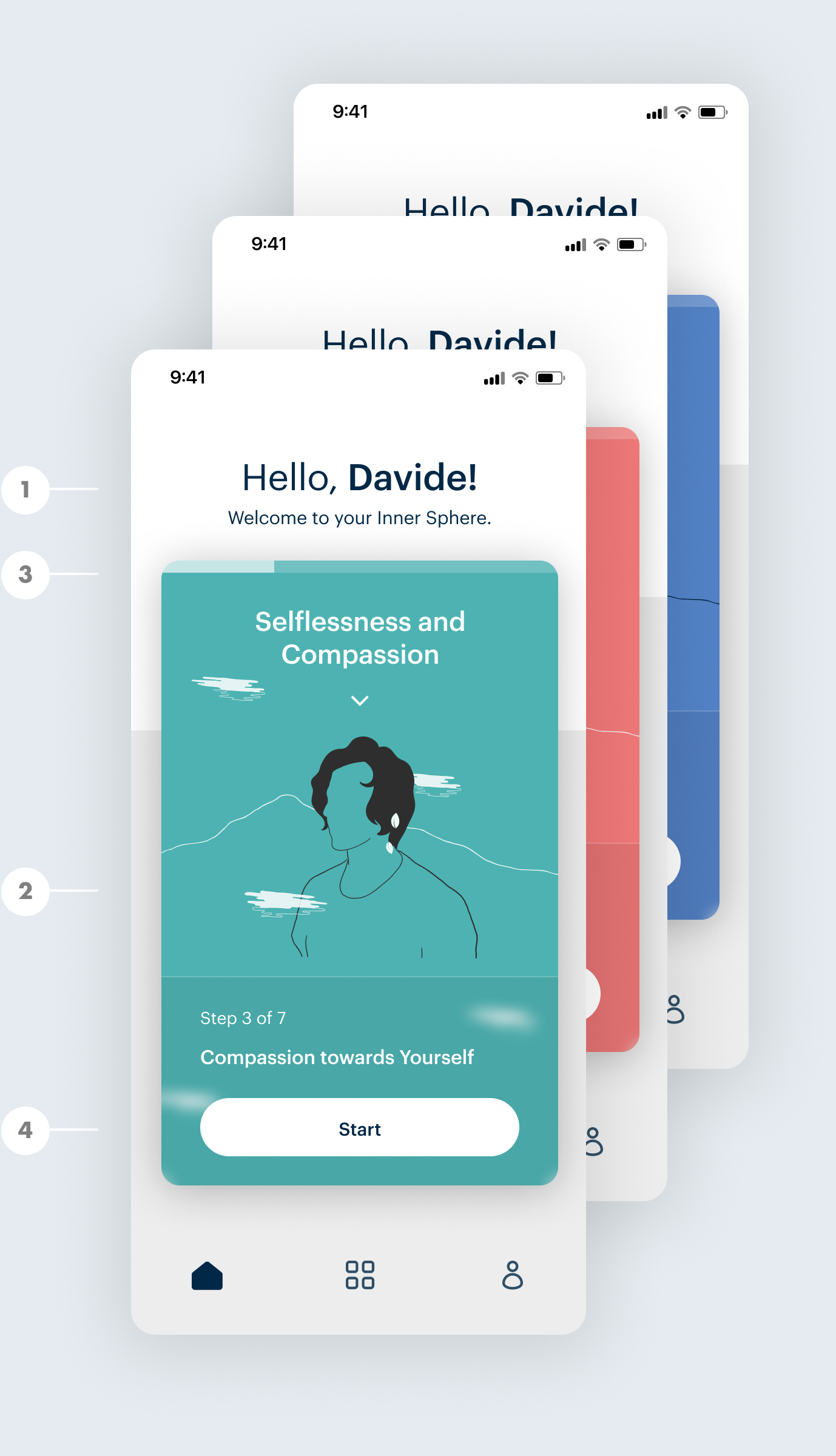
Home Page
In the app's initial release, the homepage showcases a card of the active journey, prominently highlighting the next session, nudging users toward continuity. The intention here is to encourage users to seamlessly proceed with their next session within their active journey. Before a user activates any journey initially, they are presented with a recommended journey. This recommendation, in future releases, will be curated based on user assessments.
1- Users are warmly greeted by their name, creating an instant sense of comfort and familiarity.
2- The homepage presents users with their ongoing journey and the next step to take, ensuring clarity and focus
3- Progress indicators on the active card not only shows their advancement but also instill a sense of accomplishment, motivating them to continue their journey.
4- The main Call-to-Action encourages users to begin their next session right away to help user sustain continuity.
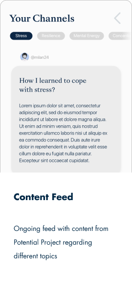
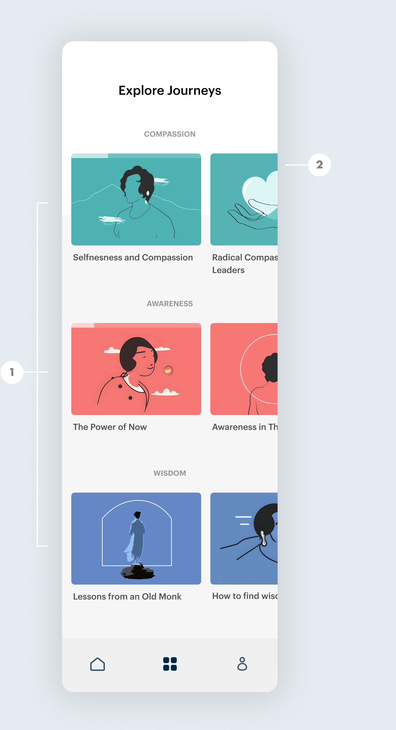
Explore Journeys
"Explore Journeys" serves as the gateway for users to browse and embark on new journeys. These journeys are categorized into three themes: "Compassion", "Awareness", and "Wisdom", each distinguished by a unique color. Within this section, users can effortlessly distinguish started, ongoing, and completed journeys, all clearly marked on the respective cards.
1- Journeys are organized into three main categories: Awareness, Wisdom, and Compassion, each distinguished by a unique color scheme.
2- Users can effortlessly monitor their progress, gaining insight into completed journeys and those yet to be explored.
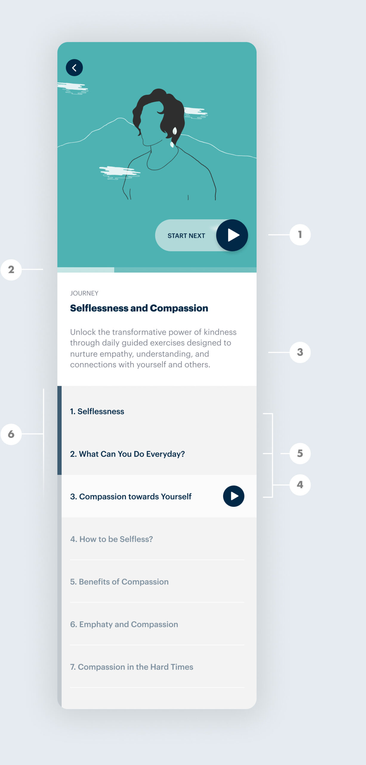
Journey Overview
On the individual "Journey" page, users are presented with a comprehensive view of a specific journey. This includes a detailed description, a list of all sessions associated with that journey, and a clear visualization of their ongoing progress throughout.
1- The prominent "Start Next" Call-to-Action enables users to seamlessly continue their mindfulness journey without the need to scroll, promoting smooth continuity and reducing information overload.
2- Minimalistic progress indicator signify achievements and encourage users to keep up with their practices without overwhelming the page.
3- Brief journey descriptions provide valuable context, enhancing engagement and understanding.
4- Users can easily differentiate completed sessions, active sessions (the next session to continue), and remaining sessions.
5- Despite the freedom to start sessions in any order, the app thoughtfully highlights the next session, promoting sequential progression.
6- Progress bars alongside each session, designed consistently throughout the app, facilitate easy tracking of growth and accomplishments.
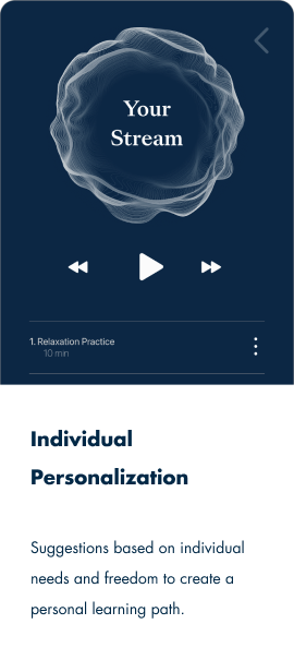
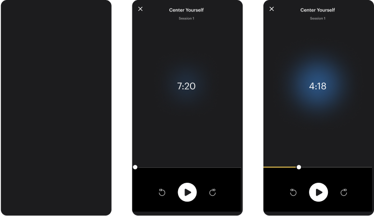
Navigating a Session: Audio Practices in the MVP's Journeys
A practice session in the envisioned product integrates interactive multimedia and intricate personalization features. However, in the first version of the MVP, the session was streamlined to feature audio practices within a series, termed as a "journey." These audio practices were personalized based on the selected duration.
For the practice screens, a dark background was chosen. This design choice aimed to minimize distractions, offering a serene ambiance that complements the meditative nature of the sessions.
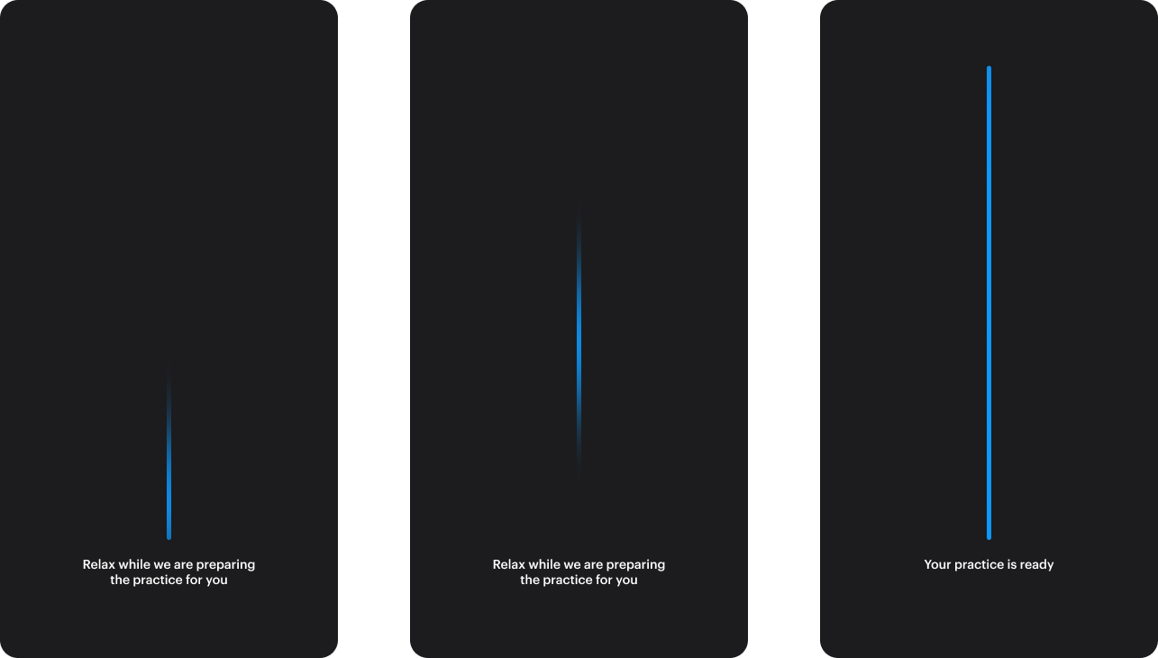
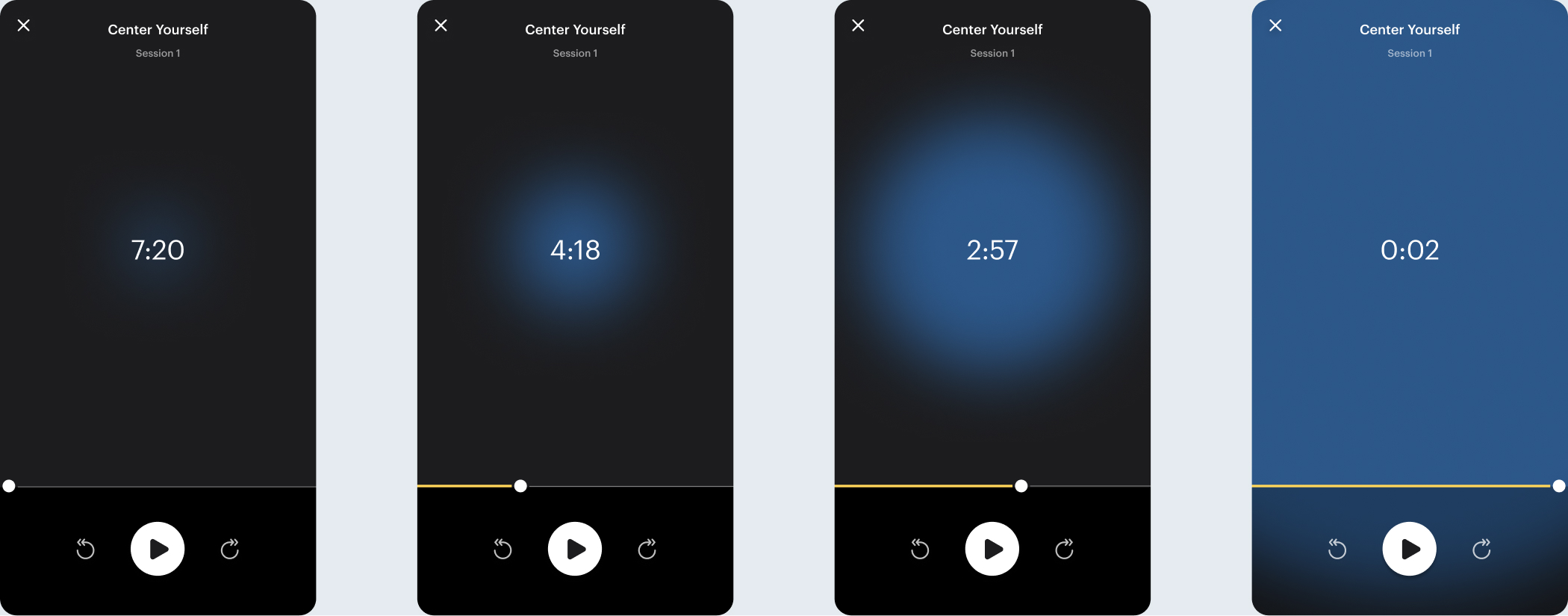
The Session's Loading Prelude:
While the session is being prepared, users encounter a loading animation, providing a seamless transition as the personalized content is assembled.
Transitions:
Transitions between screens or states have been meticulously crafted to elevate the user experience, offering a cohesive and fluid journey throughout. These transitions serve as delicate bridges, guiding users seamlessly from one moment to the next, ensuring their continuous engagement and clarity.
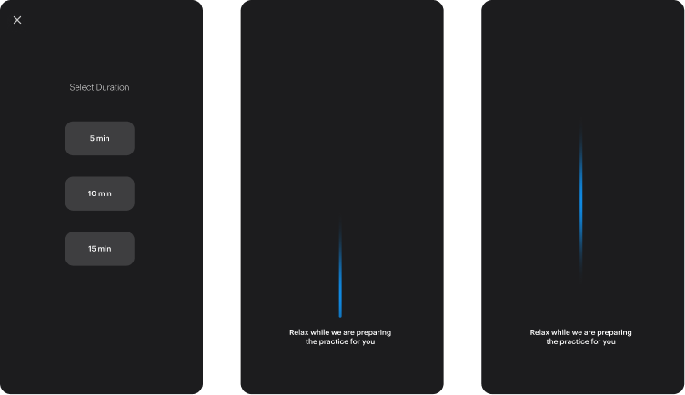
1. Upon selecting their preferences, the loading animation initiates.
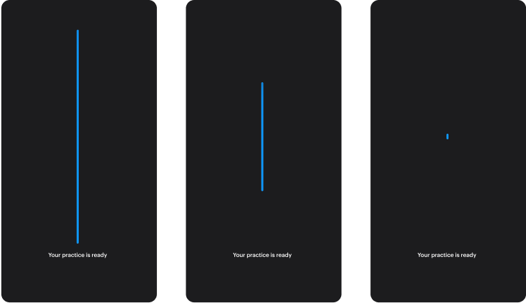
2. Once the practice is fully prepared, the progress bar fills up completely and swiftly converges into the center.
3. This action subsequently evolves into a gradually expanding blurry circle within the audio practice, ensuring a fluid and uninterrupted transition.
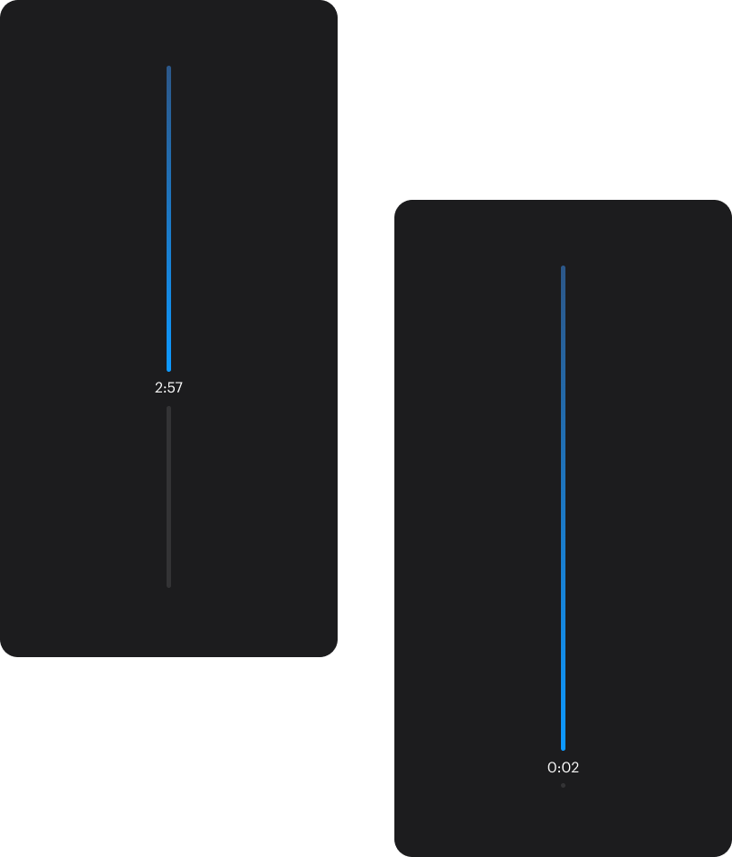
The immersive audio player features a simple, yet captivating round blue background growing from the center, symbolizing the user's evolving calmness/progress as they progress in their practice.
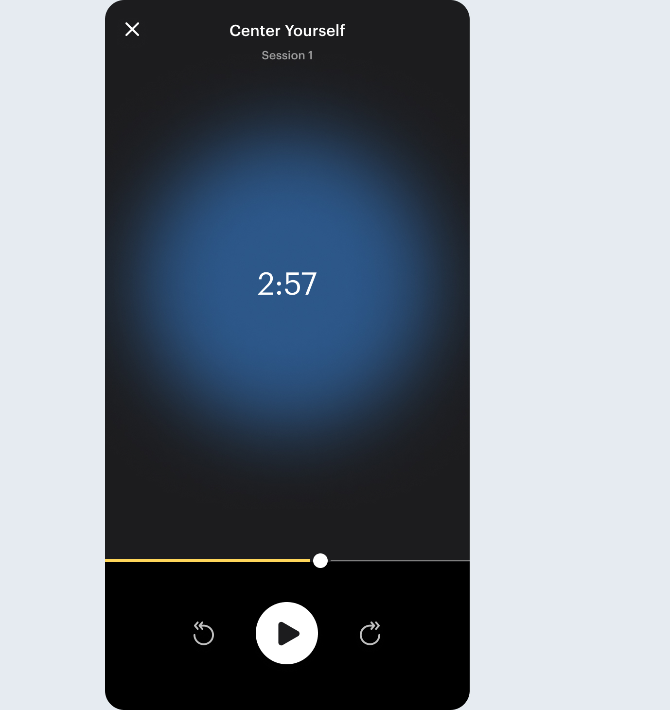
Audio Player Screensaver: The minimalist screensaver incorporates a subtle, growing blue bar to discreetly represent session progress, ensuring minimal distraction (also being mindful of the potentially dark ambient) and minimal battery consumption while easily recognizing the current stage of the played session should the user need to see during their practice.
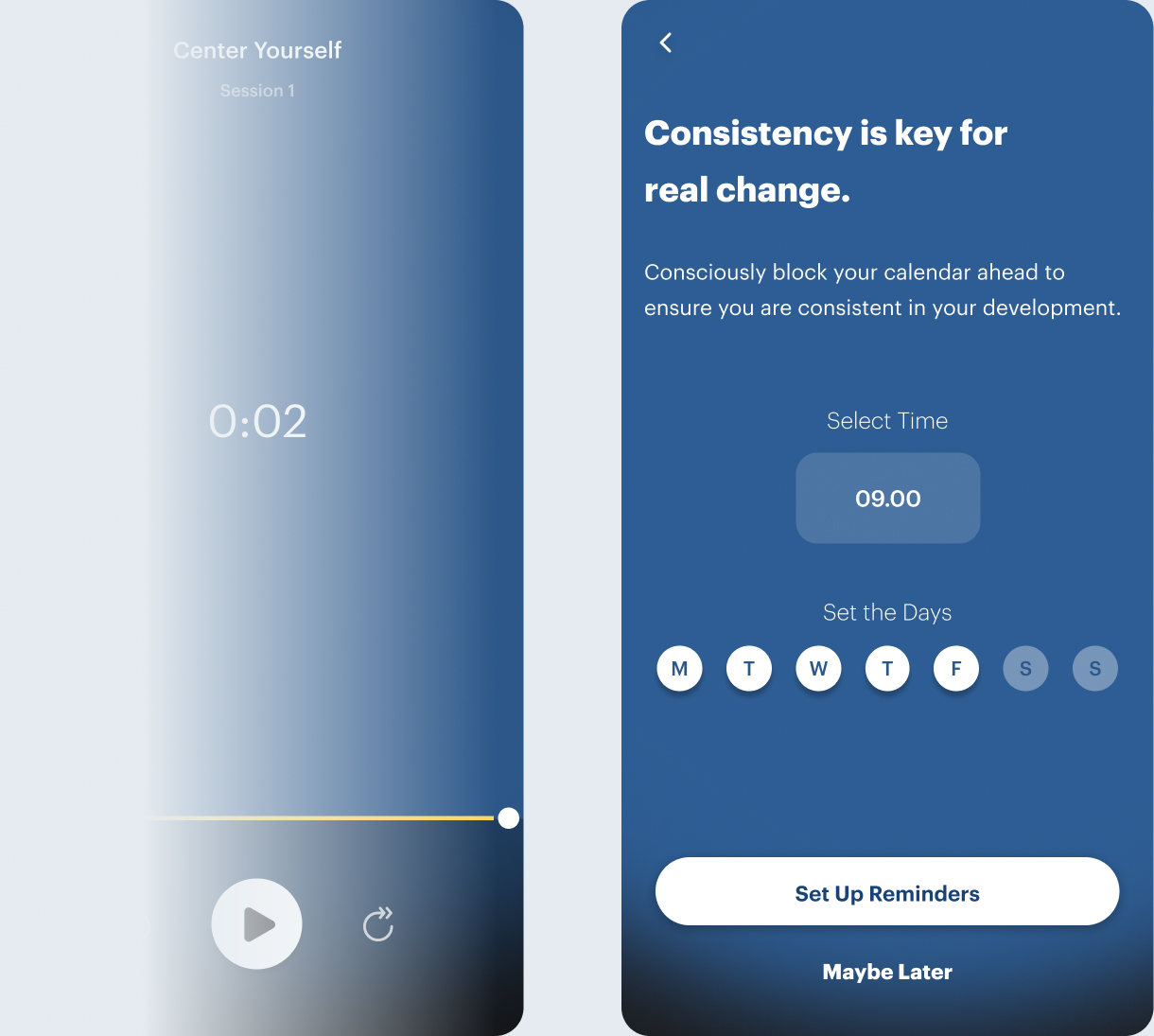
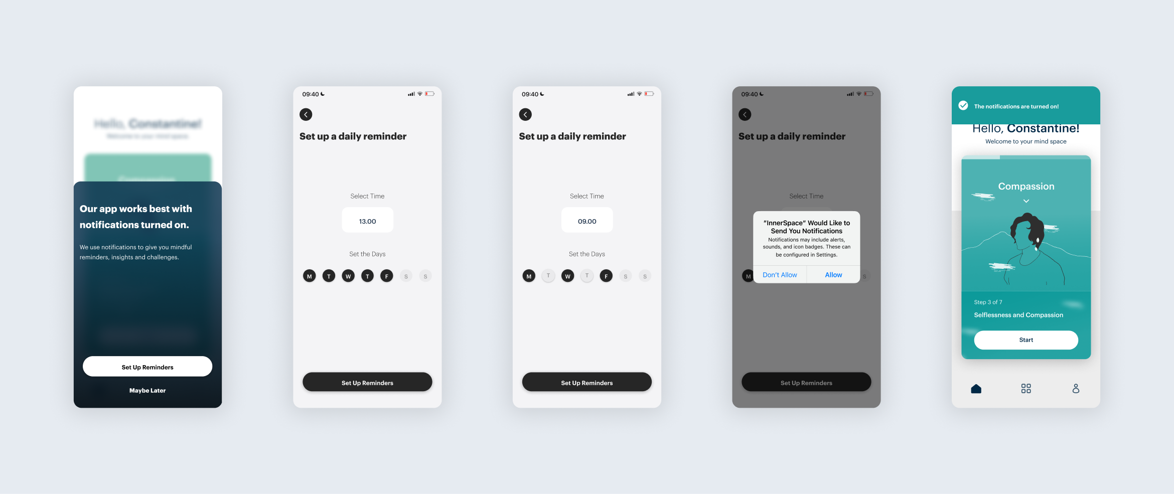
Post-session Notification Prompt: Upon concluding the session, users are prompted to enable notifications (if they haven't previously). This engagement highlights the benefits and value of staying informed through notifications.
Settings: The MVP's First Steps to Personalization
A practice session in the envisioned product integrates interactive multimedia and intricate personalization features. However, in the first version of the MVP, the session was streamlined to feature audio practices within a series, termed as a "journey." These audio practices were personalized based on the selected duration. For the practice screens, a dark background was chosen. This design choice aimed to minimize distractions, offering a serene ambiance that complements the meditative nature of the sessions.
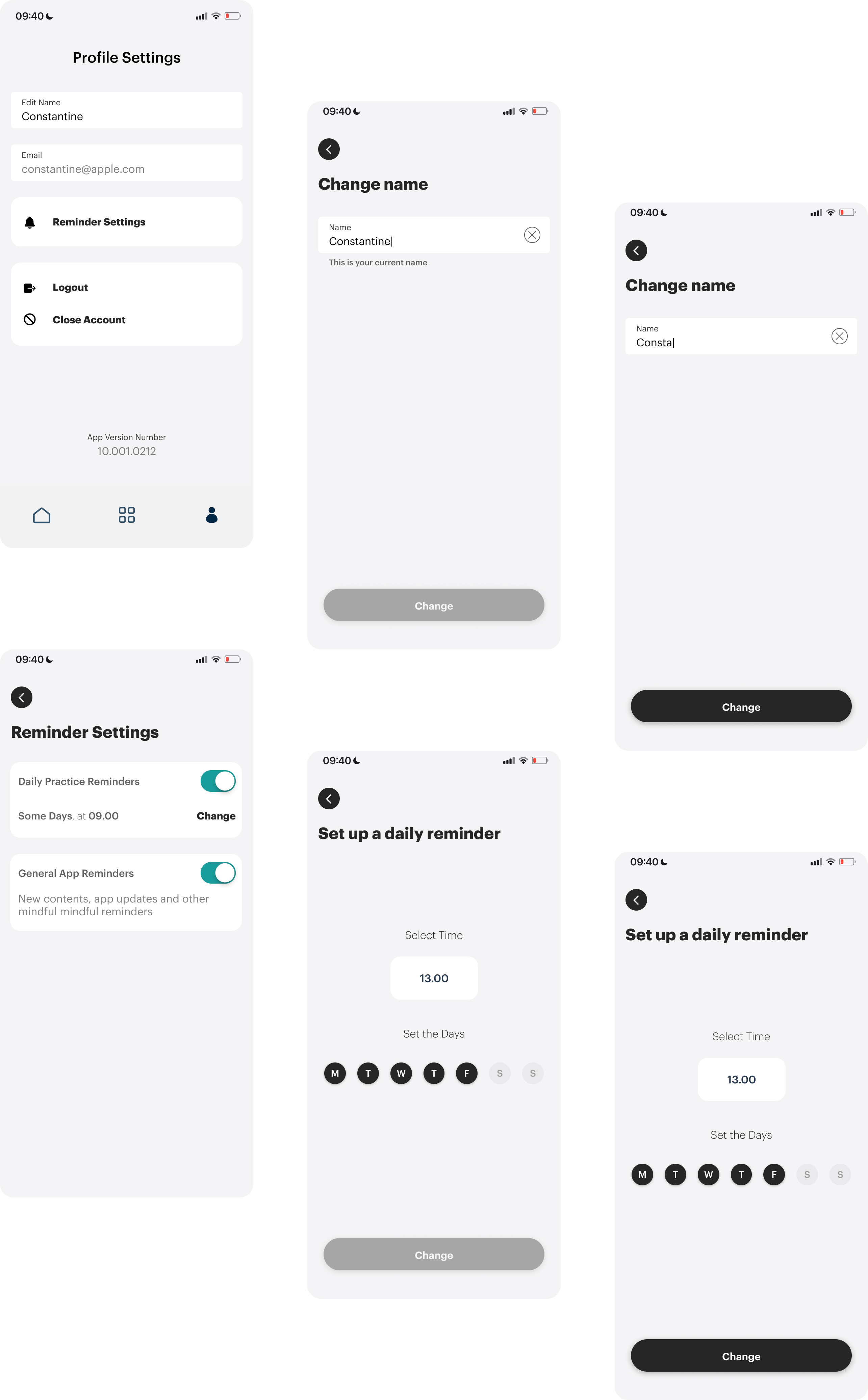
Grouping is employed within the Settings to segment related sections, enhancing clarity. This organization aids users in quickly distinguishing and understanding associated information, streamlining their navigation experience.
The Settings section features a gray background, a neutral hue selected to set it apart from the rest of the app. This distinct color choice enhances users' navigation, allowing them to easily identify their position within the application and move through it with clarity and confidence.
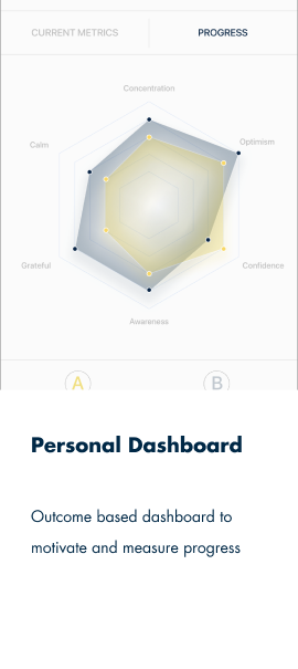
KPIs and Metrics: Driving User-Centric Design
The Potential Project Mobile Application is built with a strategic focus on key performance indicators (KPIs) and metrics to enhance user experience and engagement. This focus encompasses app usage duration, session engagement, user feedback, technical performance, and accessibility.
App Usage Duration
Goal: Increase the total time users spend engaging with the app.
Metric: Average session duration and frequency of app usage.
Method: Analytics tools to track time spent in-app and session frequency.
Purpose: Longer engagement indicates more value gained by users.
Long-term User Engagement
Goal: Foster lasting relationships with users.
Metric: Repeat usage rates, user lifecycle analysis, user retention rate (the percentage of users who continue to use the app after their initial download).
Method: Longitudinal user data analysis to evaluate retention and engagement over time
Purpose: Understand and enhance user retention and loyalty over time.
Session Engagement Analysis
Goal: Identify and resolve content or technical issues during mindfulness practices.
Metric: Point of user drop-off during sessions.
Method: Session tracking analytics to identify when and where users exit practices.
Purpose: Pinpoint areas for content improvement or technical fixe
Direct User Feedback Post-Practice
Goal: Gather immediate user reactions and detailed feedback.
Metric: Satisfaction indicators such as the Customer Satisfaction Score (CSAT) and written feedback.
Method: In-app feedback mechanism allowing users to rate and comment after each session. Surveys.
Purpose: Provide real-time, practice-specific insights for continuous improvement.
Technical Performance Metrics
Goal: Ensure the app's technical robustness and reliability.
Metric: Load times, crash rates, response times.
Method: Performance monitoring tools to track and analyze app responsiveness and stability.
Purpose: Technical efficiency directly impacts user experience and satisfaction.
Accessibility Metrics
Goal: Create an inclusive app experience for all users.
Metric: Compliance with accessibility standards, user feedback on accessibility features.
Method: Automated (tools like axe, WAVE, or Lighthouse) and manual (Expert Evaluation) testing against WCAG guidelines, and user feedback on accessibility features.
Purpose: Ensure the app is usable and friendly to users with diverse abilities.
This direct line of communication serves multiple purposes. First, it gives us real-time, practice-specific satisfaction metrics, which are crucial for assessing content quality and relevance. Second, the written feedback offers deeper, qualitative insights, which could point towards areas needing improvement, whether it's the content, pacing, or even technical aspects of the app.

Thank you for taking the time to explore this project. I hope you found it insightful and valuable. Looking forward to connecting and collaborating on future endeavors!