ZETTIT VISUAL IDENTITY
Client
Brian Haven
Sector
Information Technologies
Scope
Logo Design
Visual Identity
Zettit is a tool to help sales professionals find meaning in news and social content by intelligently organizing information using content curation and discovery technologies. At FourByNorth Studios, we have done a comprehensive study to identify and define the right brand personality for Zettit working closely with the client, Brian Haven (Co-Founder of Zettit). Once it’s defined, I have designed its visual identity based on its personality and the essence of the product.
Zettit Logo
Zettit is about empowering people to better engage with and leverage all the content the internet has to offer. This is the core belief expressed in this logo: recognizing the beauty, elegance, and complexity of the network that exists, and providing a successful tool to manage it.
Primary Logo
The logo presented above is the primary logo application: an elegant network of white nodes and lines fixed on top of a rich red background. The example above is also showing how the lock-up should be when placed in a rectangle box. The proportions are very important as it’s part of the brand. The details are described in the “Zettit Visual Identity Style Guideline”.
Black & White, Inverted Logo
This is the Zettit Logo in black &white to be used in poor printing conditions. There are other versions designed for different use to maintain the high quality of the brand communication in all situations.
Zettit Icons
For smaller applications, Zettit Icon uses the letter Z instead of the whole Zettit word. When necessary, the background network could be eliminated. A system for scaling the Zettit Logo and the Icons is designed for digital and print use to get the best result in every situation. There are instructions in the identity guideline for assistance to insure that the elements of the logo are kept intact.
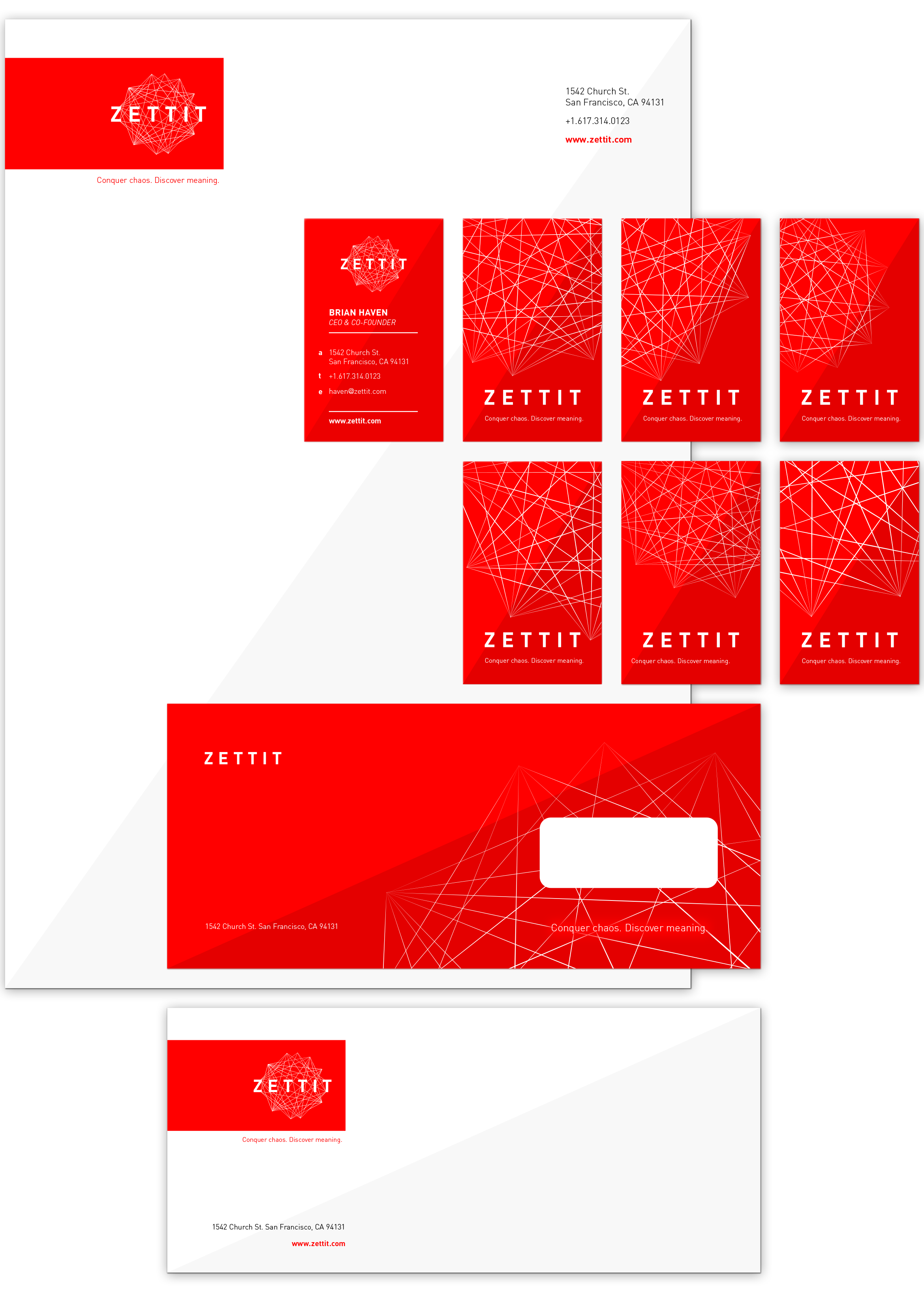
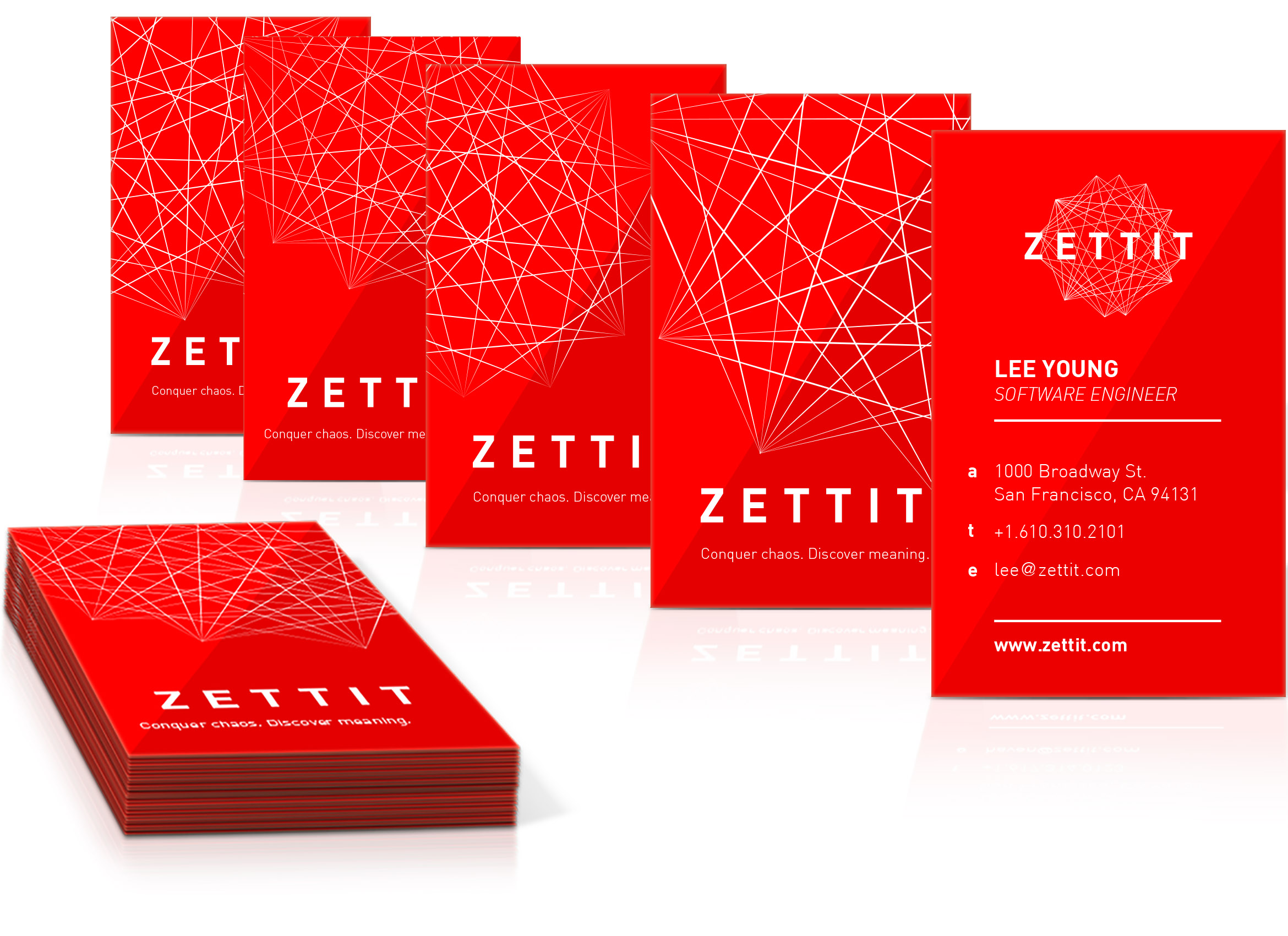
ZETTIT STATIONARY
The Zettit Identity is designed to be a very adaptable system. The logo consists of two elements, the typographic “ZETTIT” and the Zettit Supergraphic. These two elements could be separated and used graphically to enhance the brand collateral and empower the brand. Creating the variations of the Zettit Supergraphic by scaling, re-positioning and cropping; we can achieve dynamism in print, which could be achieved by animation in digital, thus creating a better link between the two mediums.
Last But Not Least!
Below you can see the stationary together. I hope you enjoyed watching it as much as I did while designing the Zettit Identity and preparing this showcase for you.